20 Trends That Don’t Actually Look Good In Real Life According To Interior Designers
Ever wondered why some homes look like they jumped straight out of a magazine while others seem to miss the mark? Interior designers know the secret – not every trendy design choice works in actual living spaces.
While social media and home shows glamorize certain styles, professionals often cringe at these popular choices.
Let’s explore what designers wish you’d reconsider before your next home makeover.
1. All-White Everything
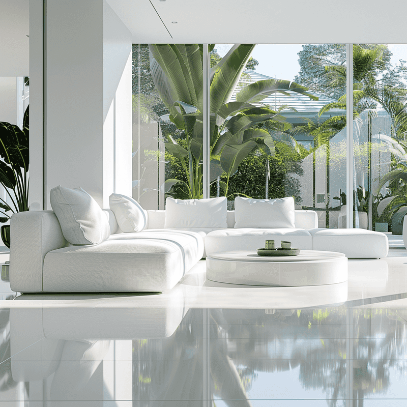
Living in a completely white space sounds dreamy until you actually… live in it. Those pristine white sofas and rugs quickly become magnets for stains and dirt.
Professional designers often joke that all-white rooms should come with a cleaning service included. In reality, these spaces feel cold, sterile, and surprisingly unwelcoming – more like a hospital than a home.
2. Word Art Signs
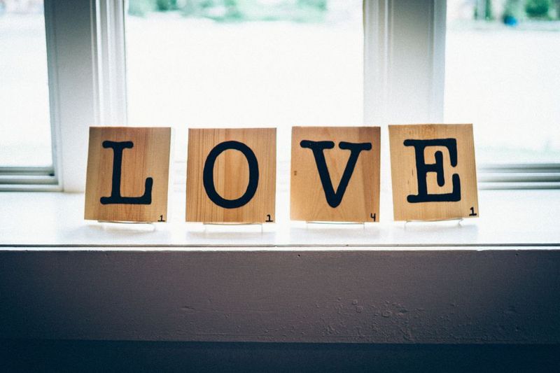
You’ve seen them everywhere – those wooden signs declaring “Live, Laugh, Love” or “Blessed.” What seemed charming in the store quickly becomes the interior design equivalent of a bumper sticker.
Many designers consider these mass-produced motivational phrases the fastest way to make your home look generic. Instead of telling guests to “Gather” in your kitchen, let your authentic personality shine through unique art pieces.
3. Barn Doors Everywhere
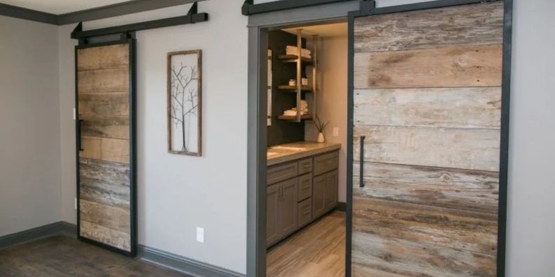
Remember when sliding barn doors seemed revolutionary? Now they’re hanging in suburban bathrooms nationwide, often looking completely out of place.
Despite their popularity, these chunky doors offer minimal privacy and collect dust in their tracks. Designers point out that unless you actually live in a converted barn, these doors typically look forced and create an awkward farmhouse-wannabe vibe in modern homes.
4. Gray-on-Gray-on-Gray
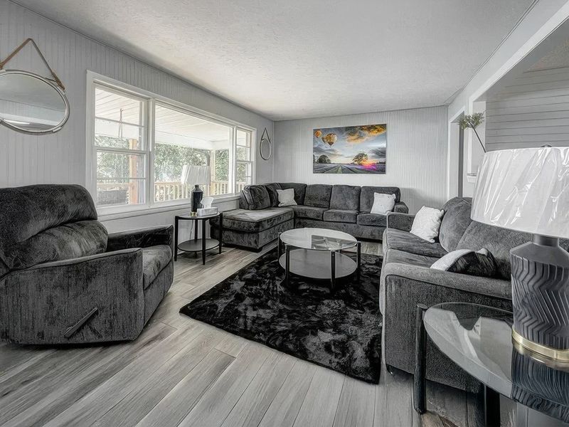
The gray trend swept through homes like a fog that refuses to lift. While initially sophisticated, all-gray spaces quickly turn depressing and lifeless.
We frequently encounter clients with “gray regret” – rooms that looked sleek in photos but feel cold and institutional in daily life. Without contrasting elements, these monochromatic spaces lack the warmth and dimension that make a house feel like home.
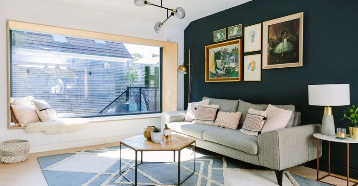
5. Accent Walls
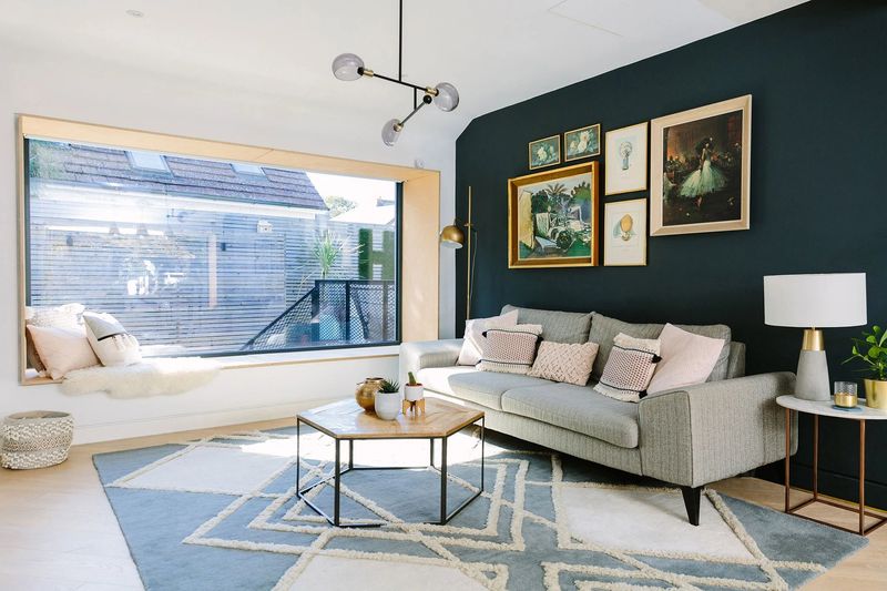
That single dark blue wall might have seemed like a bold design choice, but designers often see accent walls as indecisive decorating. “If you love the color, paint the whole room,” many professionals advise.
When poorly executed, accent walls can make spaces feel unbalanced and visually jarring. What’s meant to be a focal point frequently ends up looking like you simply ran out of paint halfway through the project.
6. Edison Bulb Overload
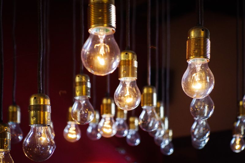
Sure, those exposed filament bulbs looked cool in that hip coffee shop, but at home? Not so much. The amber glow might create ambiance, but it’s terrible for actually seeing anything.
The industrial-chic look becomes considerably less charming when you’re squinting to read or applying makeup under their dim, yellowish light.
7. Open Shelving Kitchens
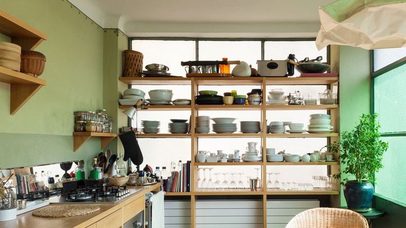
Who hasn’t swooned over those perfectly styled open kitchen shelves on Instagram? In real life, they’re dust collectors displaying your mismatched mug collection and half-empty spice jars.
Unless you’re committed to constant styling and cleaning, these shelves quickly become cluttered eyesores. Many designers confess that clients frequently request cabinet doors after living with open shelving for just a few months.
8. Vessel Sinks
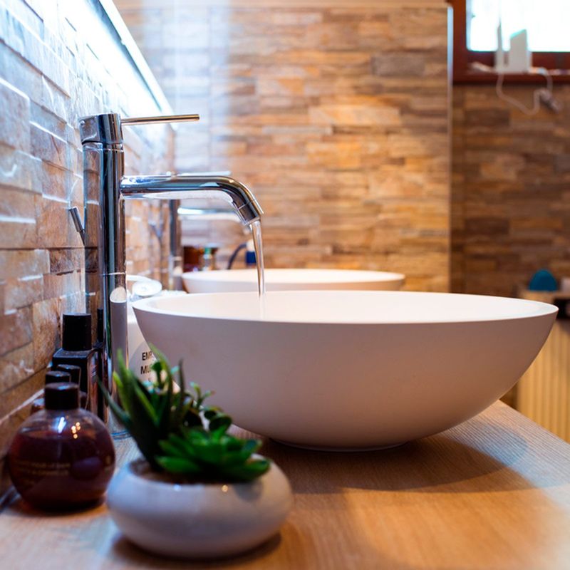
Imagine splashing water all over your bathroom counter every time you wash your hands. Welcome to the reality of vessel sinks!
While these bowl-like basins make a dramatic statement, designers report they’re functionally problematic. The raised height is often uncomfortable, water splashes everywhere, and the space where the sink meets the counter collects grime. Form over function rarely works in high-use spaces.
9. Shiplap Overload
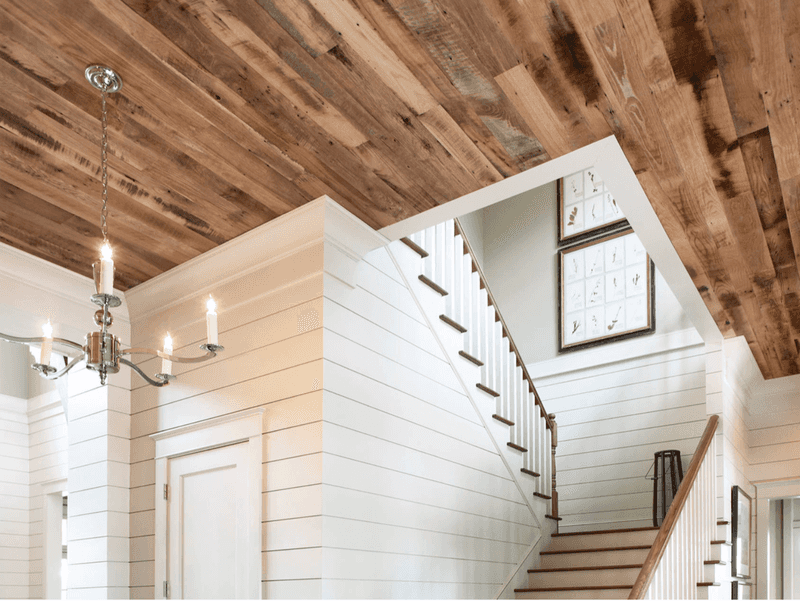
Thanks to certain renovation shows, horizontal wooden planking has invaded homes far from any coastline. What works in a beach cottage often looks bizarre in a Midwestern ranch house.
Professionals frequently see clients taking this trend to extremes – covering every vertical surface until their home resembles the inside of a shipping crate. Without context, this overwhelming wooden treatment creates a disjointed, theme-park version of coastal style.
10. Uncomfortable “Statement” Furniture
That avant-garde chair might look spectacular in your living room, but have you tried sitting in it for more than five minutes? Style without comfort creates beautiful rooms nobody wants to use.
The sculptural concrete coffee table or wire mesh dining chair might earn compliments, but they’ll remain largely unused while everyone gravitates toward the one comfortable seat in the room.
11. Giant Clocks
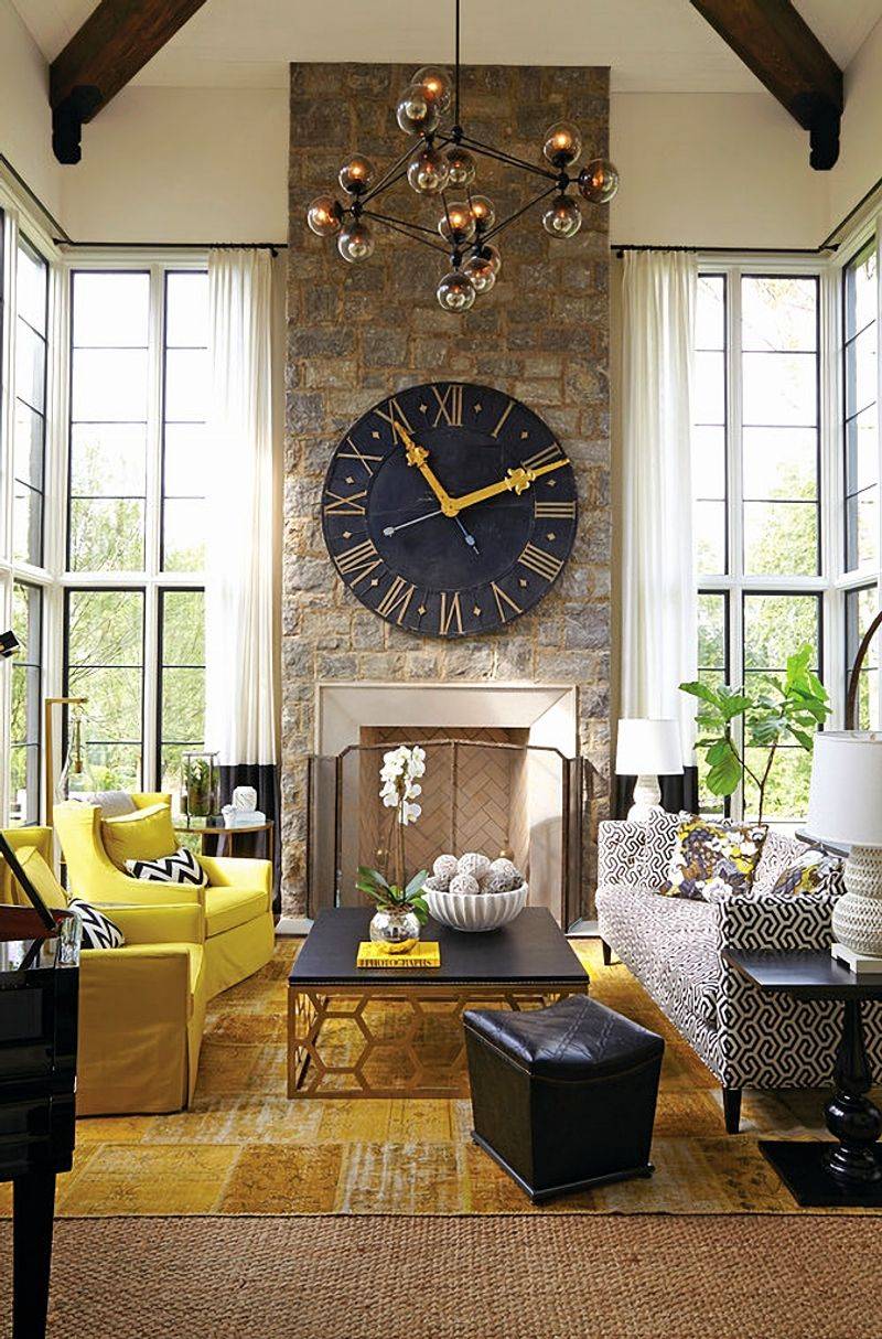
Nothing screams “I decorated with items from a big box store” quite like an oversized wall clock with Roman numerals. These massive timepieces have become the design equivalent of a default setting.
While they fill wall space efficiently, they lack the personality and meaning that makes decor special. Most end up feeling like temporary placeholders rather than thoughtful choices.
12. TV Over Fireplace
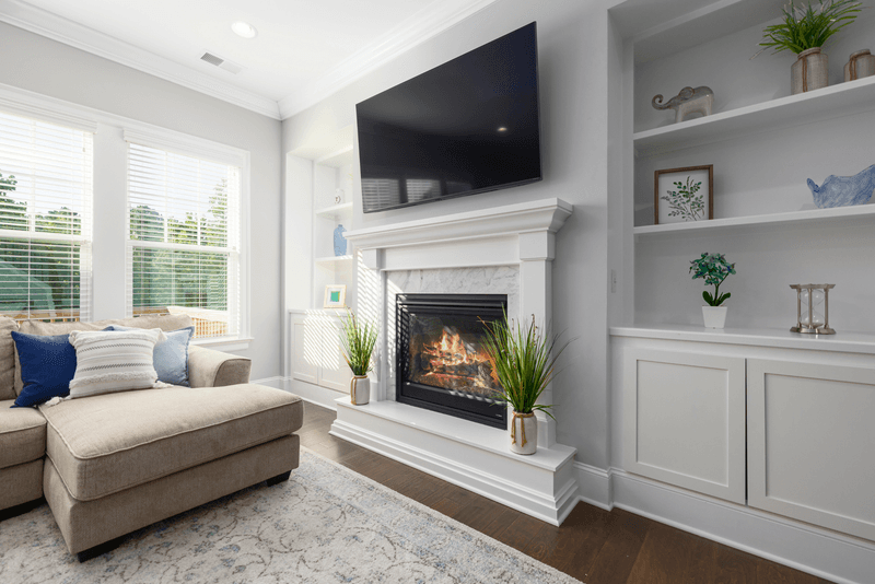
Neck pain, anyone? Mounting televisions above fireplaces has become standard practice, despite being ergonomically disastrous.
Beyond the physical discomfort of looking up constantly, designers point out that heat and electronics make poor neighbors. This arrangement forces an uncomfortable choice between ambiance and entertainment. Plus, it creates a visually overwhelming focal point that dominates the entire room.
13. Harsh Recessed Lighting
Those ceiling spotlights seemed like a good idea until they transformed your living room into an interrogation chamber. Harsh overhead lighting creates unflattering shadows and a clinical atmosphere.
We regularly encounter homes with excessive recessed lighting that creates what we call “swiss cheese ceilings.” Without dimmers and supplemental lighting sources, these fixtures create an uncomfortable, institutional feel that’s the opposite of the warm, layered lighting that makes spaces inviting.
14. Fake Plants That Collect Dust
Artificial greenery promises maintenance-free beauty, but the reality is often far from natural-looking. Those dusty silk fronds fool absolutely no one.
Even high-quality faux plants eventually become dust collectors that require regular cleaning. While real plants require care, they bring genuine life and improved air quality that no plastic imitation can match.
15. Tiny Throw Pillows
What’s the point of decorative pillows too small to actually support your head or back? Those dainty accent cushions might look cute in store displays but serve no practical purpose.
The right pillow should balance decorative appeal with genuine comfort – something many trendy options completely miss.
16. Chevron Everything
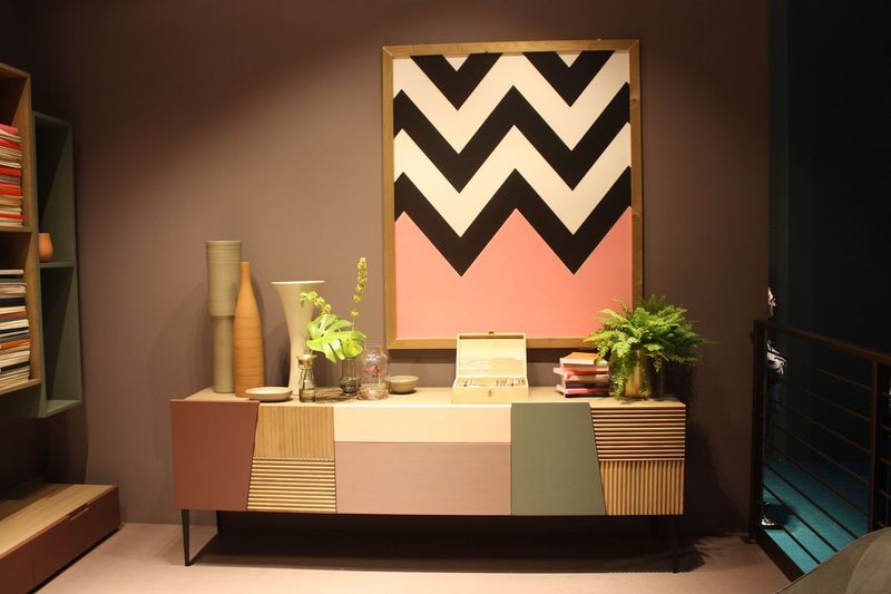
Once upon a time, those zigzag patterns felt fresh and modern. Now they’ve become the design equivalent of a bad tattoo – dated and difficult to remove.
From rugs to wallpaper to bedding, this pattern quickly overwhelms spaces and draws too much attention. What works as a subtle accent becomes visually exhausting when applied liberally throughout a home.
17. Tile Countertops
The 1970s called – they want their kitchen back! Tile countertops might seem like a budget-friendly option until you try cleaning food from those grout lines.
Beyond being bacterial breeding grounds, these surfaces create an uneven workspace where glasses tip over and rolling pins get stuck. Designers consistently rank them among the most regretted kitchen choices. The maintenance headaches and dated appearance make them impractical for modern living.
18. Popcorn Ceilings
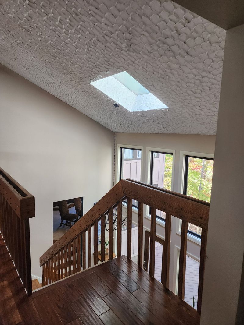
Somehow, these textured nightmares continue to hang over our heads in homes nationwide. Not only do they collect dust and look dated, but they’re nearly impossible to clean.
Originally installed as a cheap way to hide imperfections, they now instantly date a space. Plus, older versions may contain asbestos, adding health concerns to their long list of drawbacks.
19. Carpet in Bathrooms
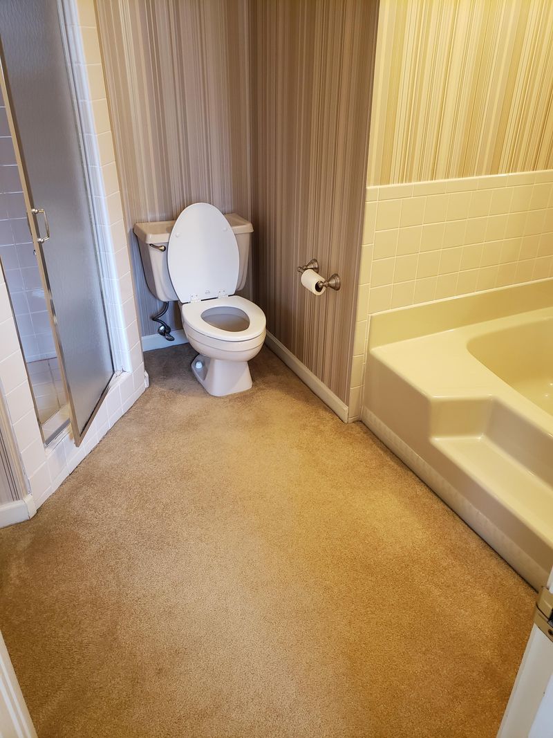
Just imagine what’s growing in those fibers! Carpet in bathrooms defies both logic and hygiene, yet somehow persists in many homes.
Beyond being a mildew paradise, these soft surfaces absorb odors and stains. What might feel cozy underfoot quickly becomes a breeding ground for bacteria that no amount of cleaning can truly remedy.
20. Mason Jar Everything
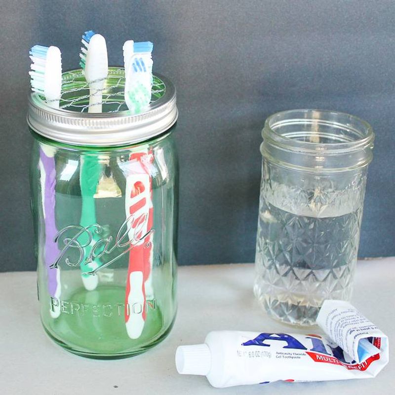
From lighting fixtures to soap dispensers, these humble canning containers have been repurposed beyond recognition. The rustic charm quickly fades when every surface features yet another mason jar craft project.
While genuinely useful in kitchens for actual food storage, their decorative applications often feel forced and unoriginal. What began as clever repurposing has become a shorthand for generic farmhouse style.