8 Paint Colors to Never Use with Oak Kitchen Cabinets And 8 That Look Really Good
Oak cabinets bring warmth and character to kitchens, but pairing them with wrong paint colors can make your space look dated or clash horribly.
Finding that perfect wall color can mean the difference between a kitchen that feels stuck in 1992 and one that celebrates oak’s natural beauty. Ready for some real talk about what works and what definitely doesn’t with those honey-toned cabinets?
1. Cool Gray – A Chilling Mistake
Cool gray against oak cabinets creates an uncomfortable tension – like wearing sandals with socks. Gray’s blue undertones fight against oak’s inherent warmth, making cabinets appear jaundiced rather than golden.
Remember Monica’s apartment kitchen makeover episode? That awkward week when everything felt disconnected? Same energy. Oak begs for companionship that acknowledges its amber soul, not an icy roommate that makes it look sickly.
2. Bright Purple – Royal Pain
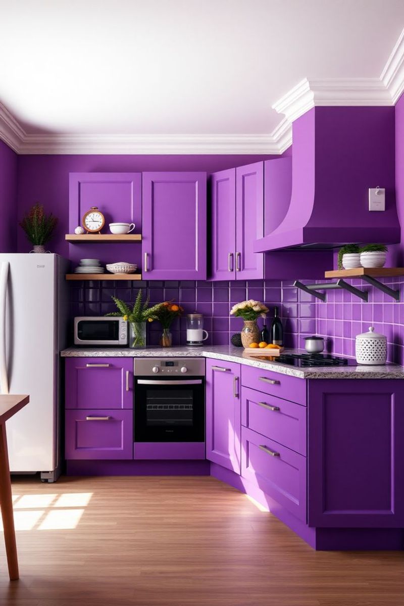
Bright purple transforms your kitchen into a bizarre wonderland where oak cabinets look entirely out of place. Every morning becomes a psychedelic breakfast experience nobody asked for.
Remember Pee-wee’s Playhouse? Delightful as a TV set, disastrous as daily living space. Purple’s regal attitude completely overwhelms oak’s humble farmhouse vibe, creating visual chaos that makes family dinners feel like acid trips.
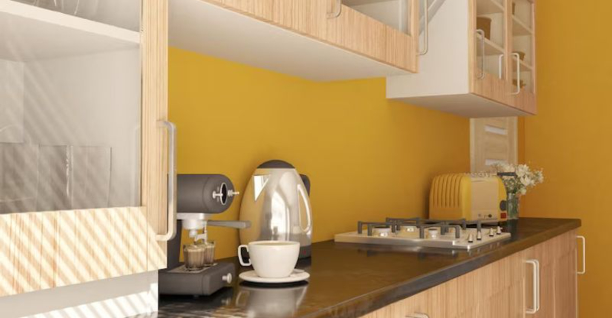
3. Highlighter Yellow – Eyestrain Central
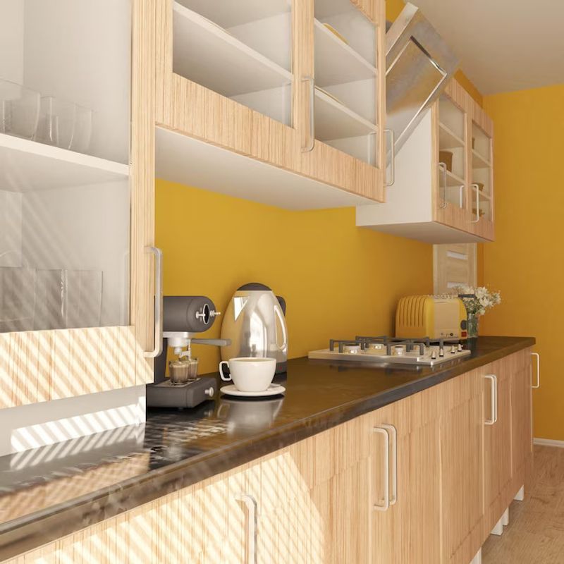
Pairing highlighter yellow with oak cabinets creates visual competition that’ll give you headaches faster than trying to assemble IKEA furniture without instructions. Both elements scream for attention simultaneously.
Sunshine walls might sound cheerful until they’re amplifying oak’s golden tones into nuclear territory. Suddenly your kitchen resembles that blinding page from your college textbook – marked up and impossible to look at directly.
4. Bluish White – Cold Shoulder Treatment
Bluish whites make oak cabinets look like they’ve caught some strange wood disease. That blue undertone creates a sickly contrast against oak’s warm amber glow.
Growing up, my neighbor’s kitchen featured this combo – walking in felt like entering a refrigerator where the food looked perpetually off. Oak deserves better than being made to look jaundiced by walls that belong in a hospital corridor.
5. Mint Green – Dental Office Flashbacks
Mint green paired with oak cabinets instantly transforms your kitchen into a 1980s dental waiting room. Nobody wants to cook in a space that triggers memories of impending root canals.
Oak’s golden-orange undertones clash spectacularly with mint’s cool personality. Your cabinets end up looking like they’re blushing with embarrassment about the walls they’re forced to live with – awkward for everyone involved.
6. Bubblegum Pink – Barbie’s Bad Decision
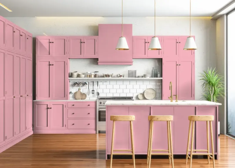
Bubblegum pink walls behind oak cabinets create a collision between adult furniture and kindergarten aesthetics. Your kitchen suddenly screams “confused identity” rather than “cohesive design.”
Imagine Ken and Barbie attempting rustic farmhouse living – that’s this combo. Oak’s serious, grounded character becomes cartoonish against saccharine pink, making your kitchen feel like an abandoned movie set where different design concepts crashed into each other.
7. Neon Teal – 90s Nightmare
Neon teal walls transform oak cabinets into relics from a forgotten fast-food chain. Remember those Taco Bell interiors from 1993? Not exactly timeless elegance.
Oak already carries strong 90s associations – pairing it with another loud 90s statement creates a time capsule kitchen nobody wants to revisit. Your cabinets will look permanently trapped in an era of slap bracelets and dial-up internet sounds.
8. Bright Orange – Saturation Overload
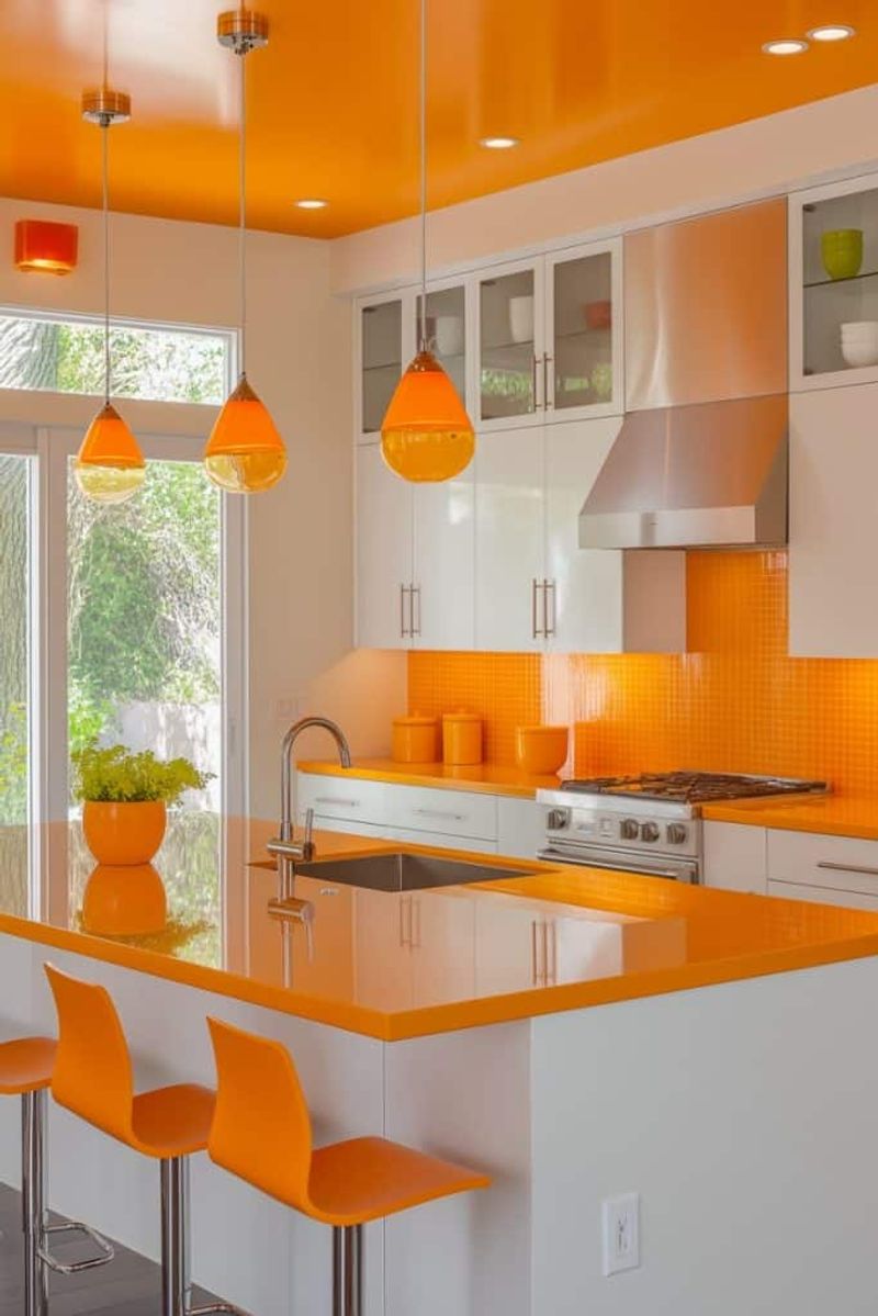
Bright orange walls with oak cabinets create a monochromatic nightmare – like wearing orange clothes with orange accessories to an orange-themed party. Too much of one color family drowns your kitchen in amber overkill.
Walking into this kitchen feels like stepping inside a pumpkin. Oak already brings orange-amber tones to the party; adding more orange is like pouring hot sauce on already-spicy food. Your eyes need contrast to appreciate wood’s natural beauty.
9. Creamy Mushroom – Earthy Elegance
Creamy mushroom paint brings out oak’s natural warmth like a perfectly toasted marshmallow. This neutral chameleon adapts to oak’s undertones rather than fighting them.
Mushroom’s subtle gray-beige personality has that ‘lived-in farmhouse’ quality – think Nancy Meyers movie kitchens where everything looks effortlessly sophisticated. Oak grain pops against this backdrop without screaming, creating visual harmony that feels both timeless and surprisingly modern.
10. Rich Navy – Unexpected Sophistication
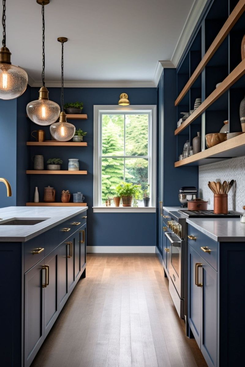
Navy blue walls transform oak cabinets from suburban standard to sophisticated statement. Dark blue creates dramatic contrast while somehow making oak look intentionally chosen rather than builder-grade default.
Remember when mom jeans became fashionable again? Navy does that for oak – suddenly what felt dated becomes characterful and deliberate. Your cabinets’ amber tones pop like golden hardware against navy’s depth, creating that expensive-looking contrast interior designers charge thousands to achieve.
11. Deep Olive – Nature’s Perfect Partner
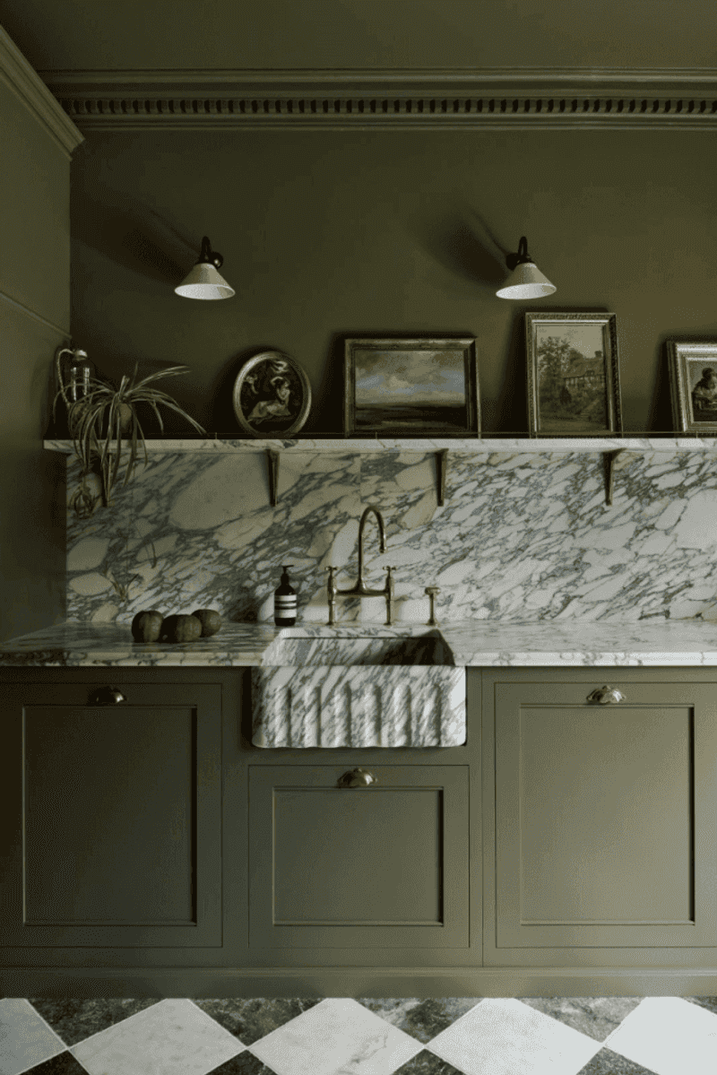
Deep olive green walls make oak cabinets feel like they’ve found their soulmate. Both elements share earthy origins, creating harmony that feels organic rather than designed.
Walking into an olive-and-oak kitchen feels like entering a sunlit forest. Green’s natural undertones complement wood’s amber qualities without competing. Suddenly those cabinets from 1995 look intentionally collected rather than leftover – like vintage furniture passed down through generations.
12. Terracotta – Southwestern Warmth
Terracotta walls embrace oak’s warmth like an old friend. This earthy orange-red creates a sunset glow that makes everyone look better – including your cabinets.
Remember those cozy kitchen scenes in 90s sitcoms where families actually talked instead of staring at phones? That’s terracotta energy. Oak grain becomes a feature rather than a bug, creating textural interest against terracotta’s subtle variations.
13. Sage Green – Vintage Tranquility
Sage green walls with oak cabinets channel grandma’s kitchen in the best possible way – comforting, timeless, and mysteriously good-smelling. This muted green has enough warmth to complement oak’s golden undertones rather than fight them.
Sage creates that collected-over-time feeling that makes kitchens feel like genuine gathering spaces. Oak cabinets suddenly look like cherished antiques against this backdrop, even if they’re actually from a 1992 builder-grade catalog.
14. Warm Taupe – Subtle Sophistication
Warm taupe creates magic with oak cabinets – suddenly your kitchen has that expensive, custom-designed look without actually replacing anything. This chameleon color adapts to oak’s undertones, creating seamless transition between walls and cabinetry.
Taupe’s subtle depth makes oak grain look intentional rather than dated. Your kitchen gains that effortless sophistication of Nancy Meyers movie sets where everything feels both aspirational and somehow lived-in.
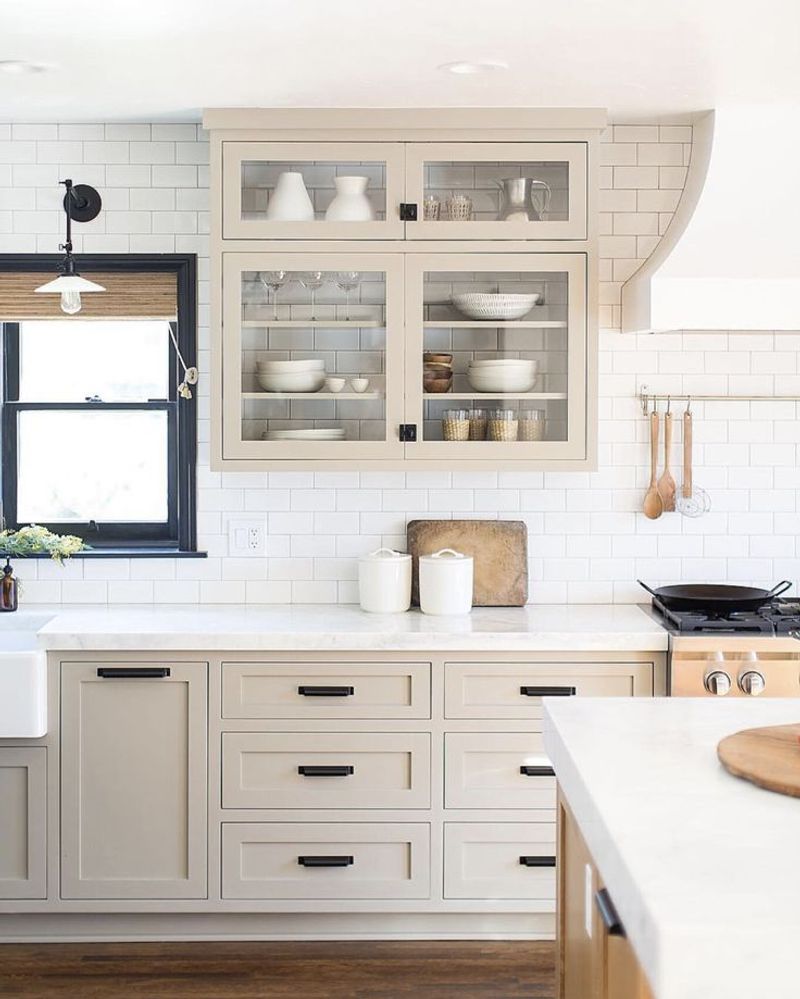
15. Soft White – Bright Without Bite
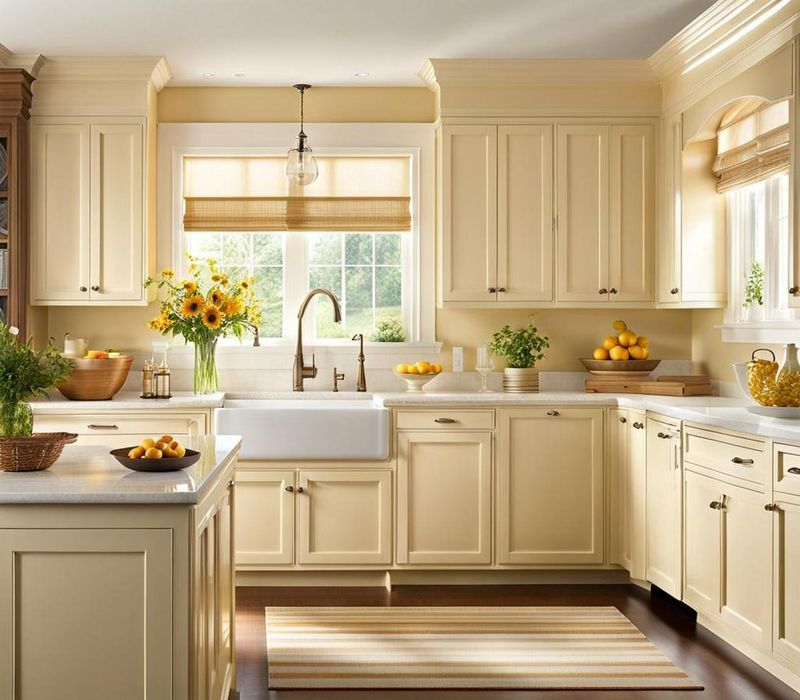
Not all whites work with oak, but cream-based whites with yellow undertones make cabinets sing rather than shriek. Soft white creates contrast without cold clinical vibes.
Many designers reflexively paint everything white, but soft white specifically respects oak’s warmth. Your cabinets look intentionally chosen rather than waiting for replacement, creating that collected-over-time aesthetic that makes kitchens feel like authentic gathering spaces.
16. Burnt Sienna – Rustic Harmony
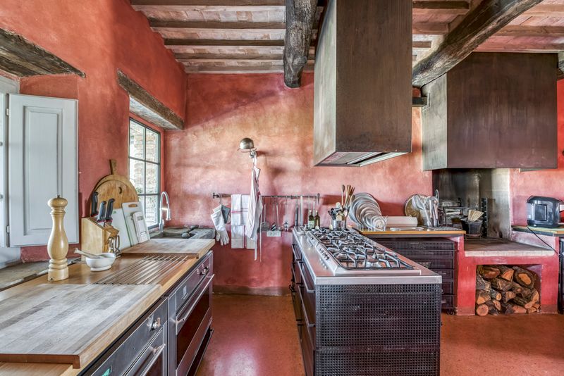
Burnt sienna walls create instant rustic Italian villa vibes with oak cabinets. This rich, earthy red-brown feels like it was specifically created to complement wood tones.
Walking into a kitchen with this combination feels like stepping into a Tuscan cookbook – suddenly simple pasta seems gourmet. Oak grain becomes textural art against sienna’s depth, creating visual interest that makes your cabinets look deliberately chosen rather than builder-grade default.