24 Colors You Shouldn’t Paint Your Cabinets, According To Designers
In the quest to refresh your kitchen, the choice of cabinet color can dramatically influence the overall vibe of the space. However, not all colors are created equal, especially when it comes to painting your cabinets.
Some hues might seem enticing but fall short in practicality or style. Allow me to guide you through 24 colors that, according to designers, should be avoided for your kitchen cabinets.
1. Neon Green
If you’ve ever thought about painting your cabinets neon green, think again. This intense shade can be overwhelming, making your kitchen feel chaotic rather than calming.
Though it might seem like a bold choice, it often clashes with other decor elements. Instead, consider shades that offer vibrancy without overpowering the space.
However, if you love green, why not try a softer sage or mint? These alternatives provide a fresh feel without the harshness of neon.
2. Fire Engine Red
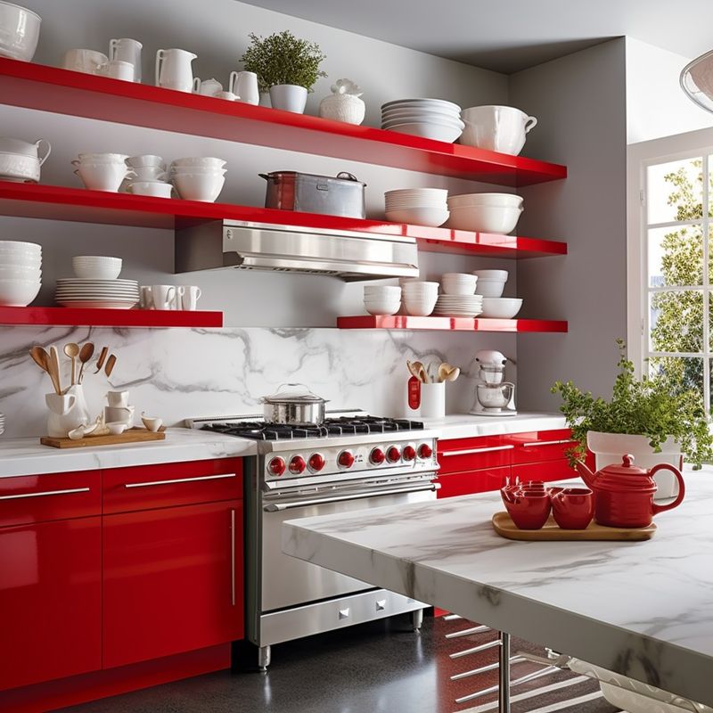
Fire engine red might ignite passion, but in a kitchen, it can be too intense. It demands attention, leaving little room for other elements to shine.
Where a subtle pop of red could work, saturating your cabinets in this color is often overwhelming. It’s wise to think of red as an accent rather than the main event.
Hence, opting for a muted burgundy or terracotta can maintain warmth without dominating the entire room.
3. Highlighter Yellow
How often do you reach for a highlighter yellow paint swatch? While it grabs attention, it might be too vibrant for cabinets.
This bold color can quickly make your kitchen feel more like a classroom than a comforting culinary space. Consider using yellow in smaller doses to add cheer without overdoing it.
If yellow is your favorite, a buttery yellow or gold can offer a softer, more welcoming atmosphere.
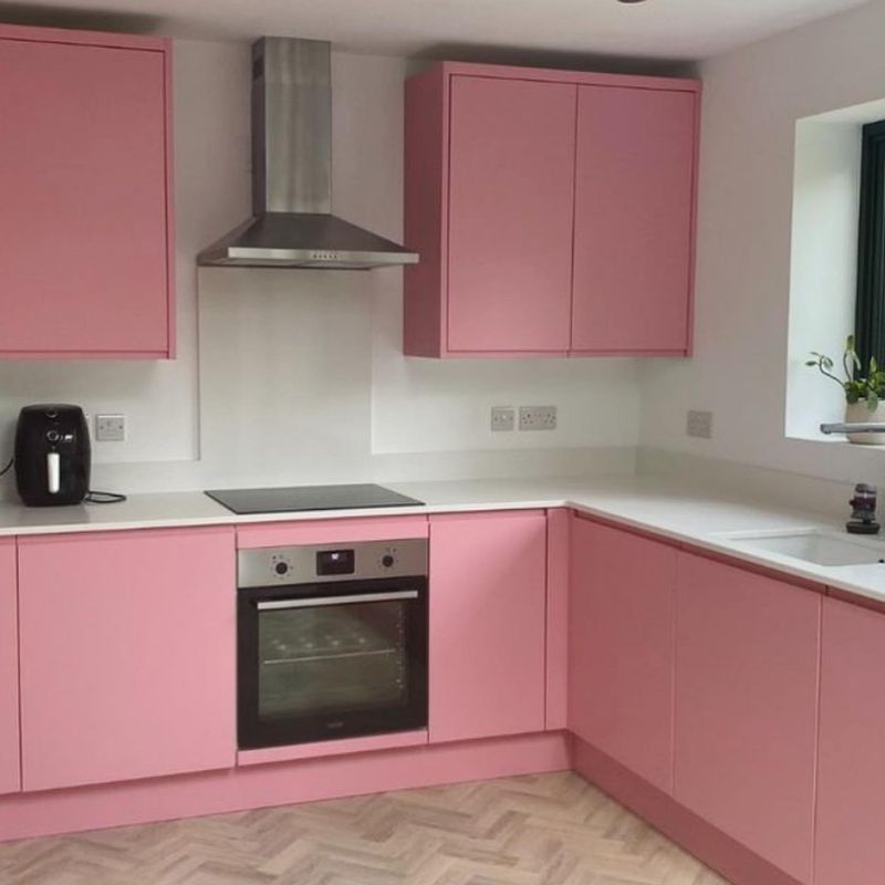
4. Pastel Pink
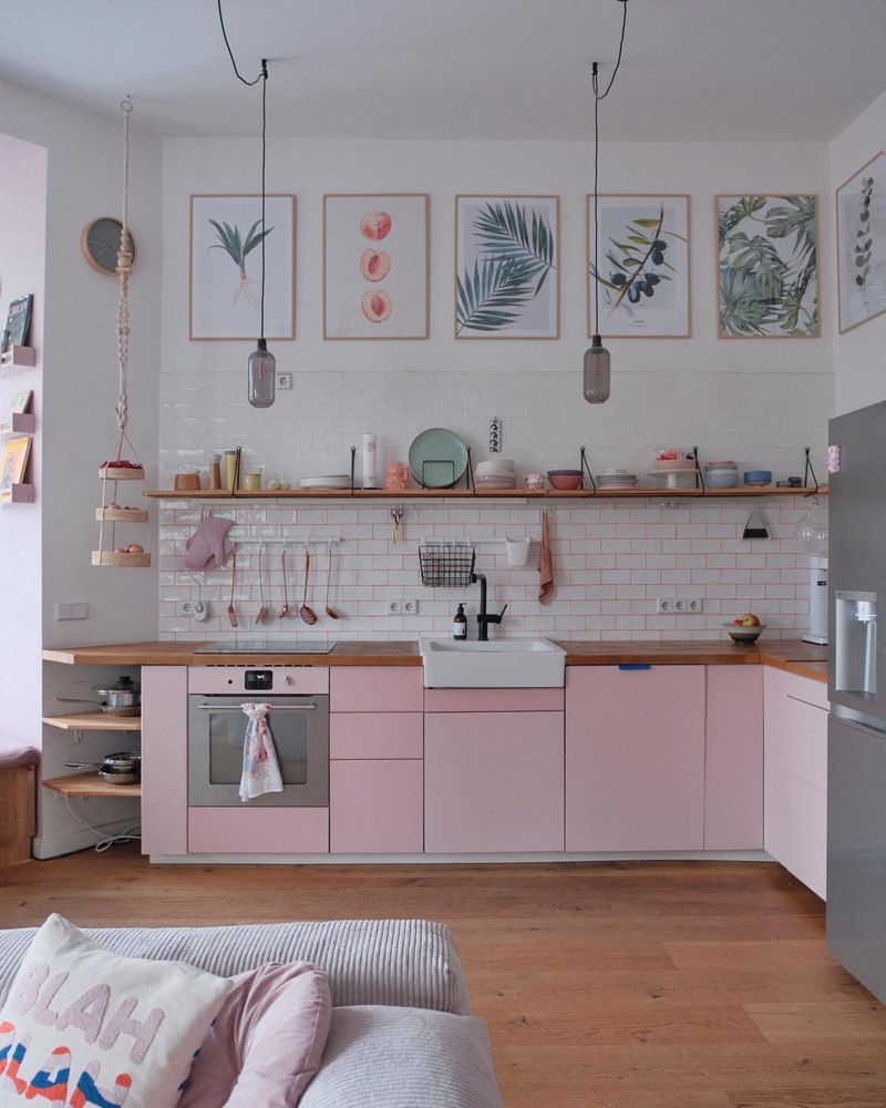
However charming pastel pink might appear, it often lacks the depth needed for cabinets. This color can easily feel juvenile, detracting from a mature kitchen aesthetic.
If you’re drawn to pink, try a dusty rose or salmon. These hues offer elegance while still incorporating that rosy touch.
Thus, choosing a pink with more substance ensures your kitchen feels stylish without losing its charm.
5. Deep Purple
Deep purple might evoke luxury, but it can also cast a heavy shadow on your kitchen. It’s a color that can feel oppressive, especially in smaller spaces.
Though purple can add richness, it’s better suited for accents rather than entire cabinets. You might explore lighter lilac or periwinkle for a softer touch.
Therefore, balancing the richness with lighter tones can prevent your kitchen from feeling weighed down.
6. Electric Blue
Electric blue is vibrant, yet it often feels more suited to a surfboard than a kitchen cabinet. This color can be jarring, clashing with a more serene kitchen vibe.
When considering blue, why not explore navy or sky blue? These tones offer sophistication and tranquility without overwhelming.
Hence, choosing a softer blue invites peace and complements a wide array of kitchen styles.
7. Black
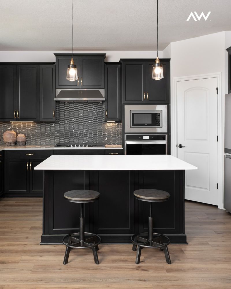
Black might sound chic, but it can make your kitchen feel more like a cave than a culinary haven. It absorbs light, shrinking the space visually.
While black can be elegant, it’s crucial to balance it with lighter elements. You could incorporate black through hardware or accents instead.
Hence, if you love dark colors, charcoal or slate could offer depth without sacrificing warmth.
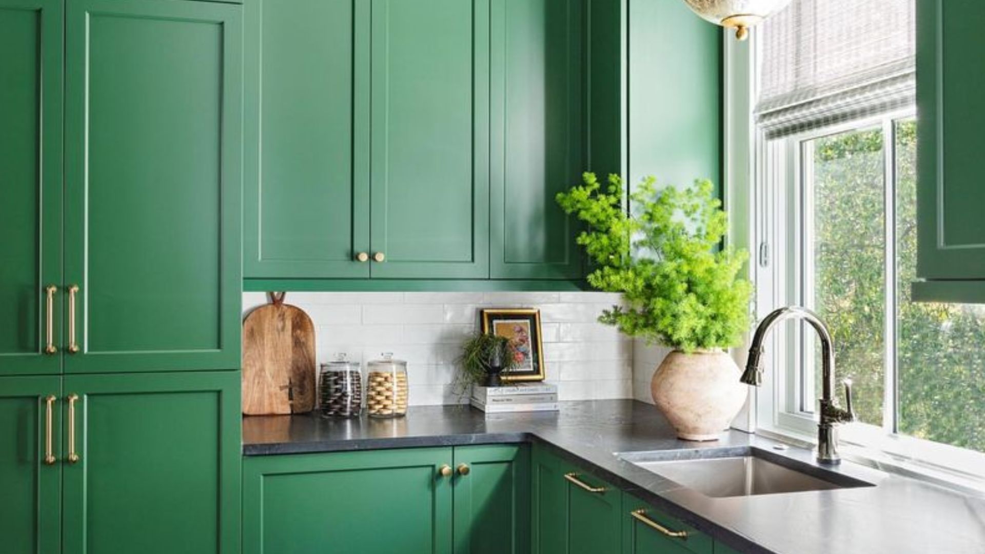
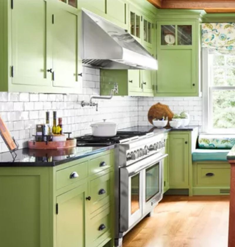
8. Mint Green
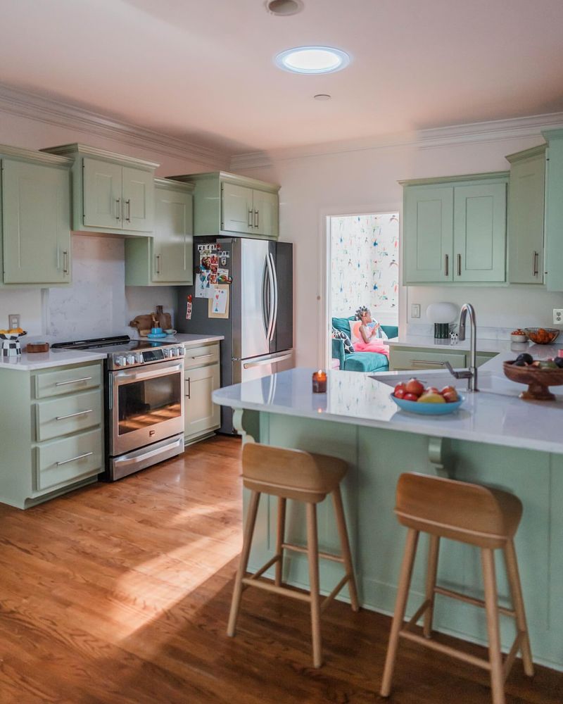
While mint green offers a retro charm, it can sometimes feel too dated for modern kitchens. This color can easily overpower, giving an unintentional vintage look.
Therefore, if you desire a green touch, why not consider olive or forest green? These shades bring nature inside, offering a timeless appeal.
Thus, selecting a deeper green ensures your kitchen remains stylish and relevant.
9. Barbie Pink
Barbie pink might bring back childhood memories, but in a kitchen, it can be more jarring than joyful. It’s a bold choice that can overwhelm rather than complement.
However, if pink is your passion, try incorporating it in subtler ways—perhaps through accessories or small appliances.
Hence, a more subdued shade, like blush, can allow for a gentle, sophisticated touch without overpowering your decor.
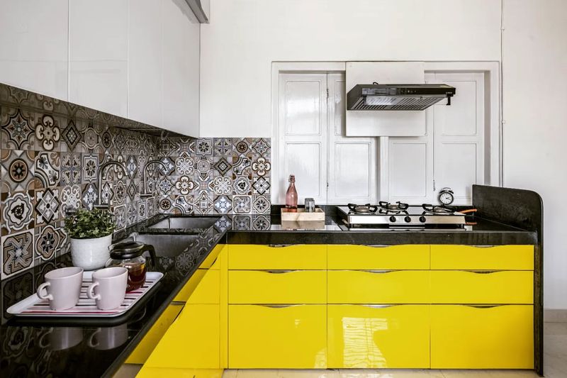
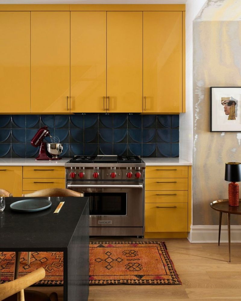
10. Canary Yellow
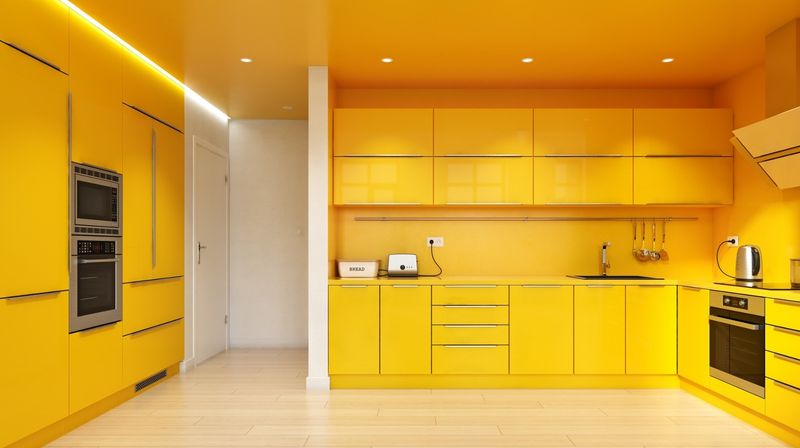
Canary yellow offers brightness, but it can easily cross into territory that feels more startling than welcoming. It’s a color that often dominates rather than complements.
If yellow appeals to you, why not experiment with softer shades that still provide warmth? A soft cream or wheat can brighten without overwhelming.
Hence, selecting a muted yellow ensures your kitchen remains cheerful without overwhelming the senses.
11. Chocolate Brown
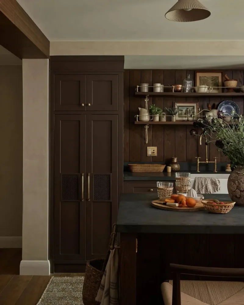
Chocolate brown might feel rich but often reads as outdated in modern kitchens. This color can make spaces feel smaller and more enclosed than desired.
However, if you love the warmth of brown, consider opting for lighter shades like taupe or tan, which offer a contemporary twist.
Thus, balancing warmth with modernity allows for a space that feels inviting yet up-to-date.
12. Peach
Though soft and warm, peach can feel out of place in a kitchen setting, often reading too youthful or out of style.
If you’re fond of peach, consider using it as a subtle accent rather than the main color. Incorporating peach through decor can add warmth without dominating.
Therefore, choosing more subdued tones like apricot can still provide that sunny feel without overpowering the room.
13. Lavender
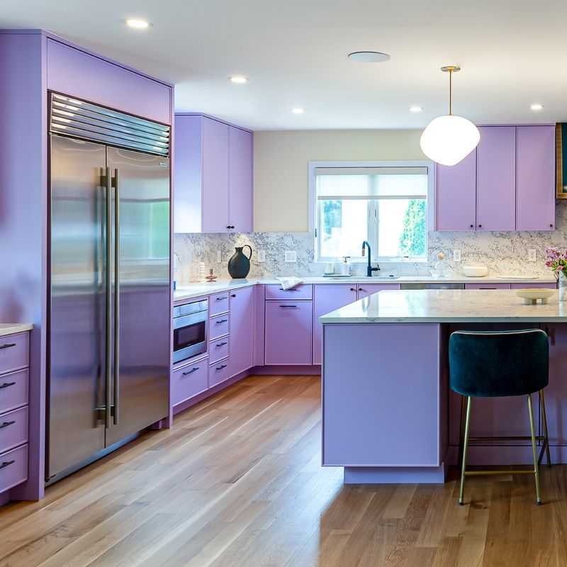
Lavender, while soothing, can make kitchen cabinets feel too soft and whimsical for a space meant for productivity and functionality. This gentle hue lacks the contrast needed against typical kitchen neutrals, making the room appear washed out.
Designers find that lavender often struggles to stand up against the robust colors usually seen on countertops and backsplashes. For a more practical and stylish option, consider shades that offer a bolder yet complementary contrast.
Integrating colors that provide depth and dimension will enhance your kitchen’s overall appeal and usability.
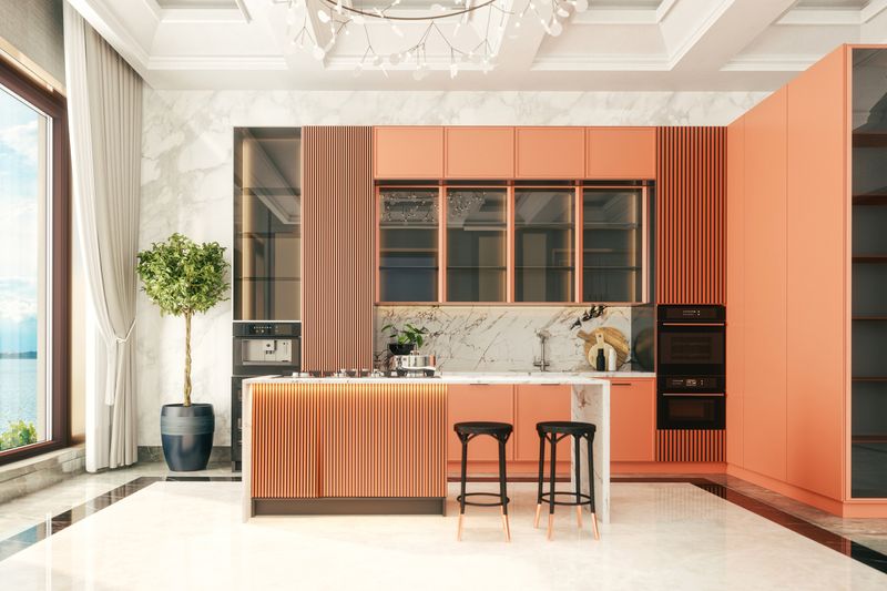
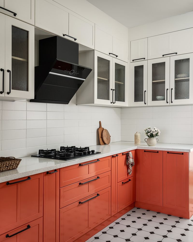
14. Tangerine Orange
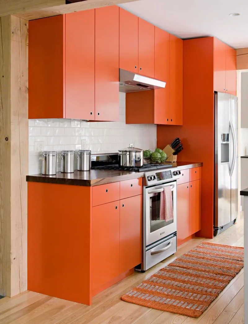
Tangerine orange delivers energy but can be overwhelming in large doses. It tends to dominate rather than blend with other elements.
Where bright orange might feel too much, subtle terracotta or burnt orange can provide warmth without excess.
Therefore, softer shades allow for a vibrant yet balanced environment that feels welcoming and stylish.
15. Dark Teal
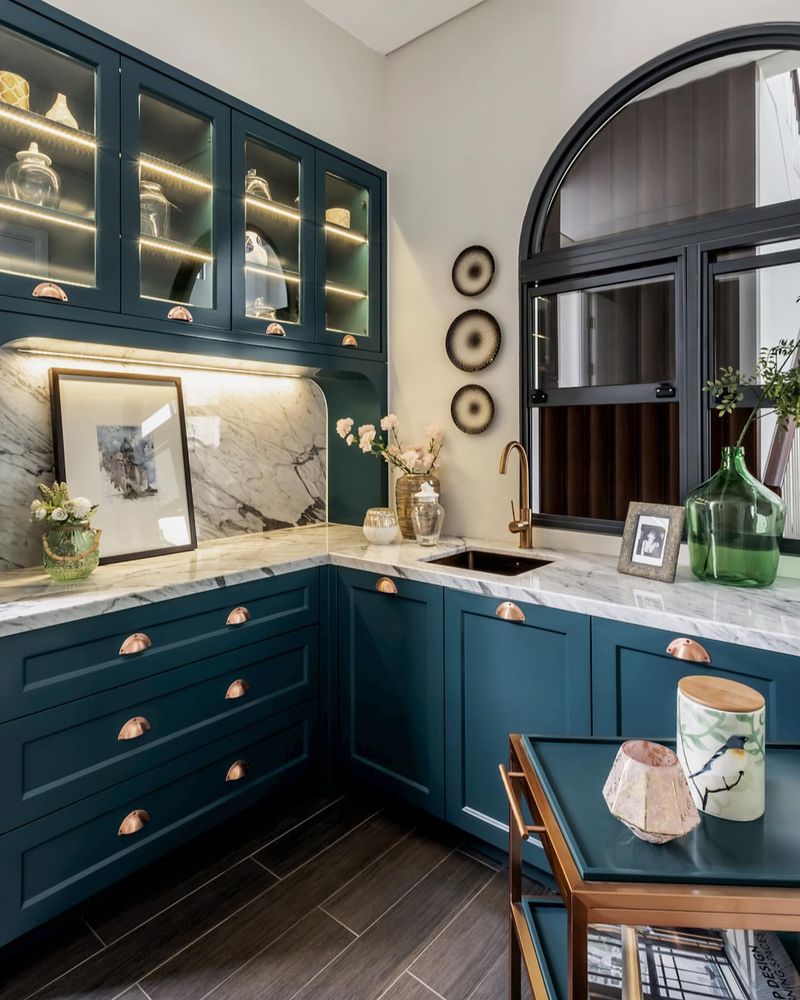
Dark teal might seem elegant, but it can make your kitchen feel enclosed rather than expansive. It’s a color that can overshadow rather than support.
If teal appeals, why not consider lighter shades like aqua or turquoise? These options maintain a refreshing essence without closing in the space.
Hence, opting for a lighter teal can provide elegance and openness in your kitchen.
16. Berry Purple
Berry purple is vibrant but can easily become overwhelming in a kitchen. It often distracts from the overall aesthetic rather than enhancing it.
If you love purple, why not try a lavender or mauve? These softer hues provide a touch of color without dominating the space.
Thus, choosing a muted purple ensures a more balanced and harmonious kitchen environment.
17. Mustard Yellow
Mustard yellow might evoke a retro vibe, but it can make your kitchen feel dated and dark. This shade tends to absorb light, making spaces feel smaller.
However, if you’re fond of yellow, consider brighter alternatives like sunflower or goldenrod to retain warmth without heaviness.
Thus, opting for a lighter, more cheerful shade can enhance your kitchen’s appeal without looking old-fashioned.
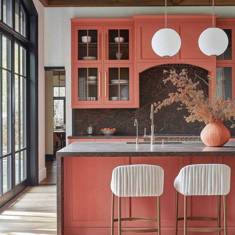
18. Coral
Coral can be vibrant, yet it often feels too bright for kitchen cabinets, becoming the focal point unintentionally.
If coral captivates you, consider using it sparingly, perhaps in textiles or small accents. This way, you preserve its energy without overwhelming the space.
Hence, a more subdued shade like salmon ensures vibrancy without dominating your kitchen’s style.
19. Kelly Green
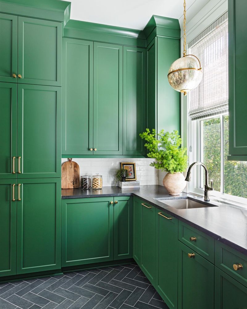
Kelly green is invigorating but can be too bold for a kitchen, potentially creating a jarring effect. It tends to overshadow other design elements.
If green inspires you, explore more subdued options like emerald or jade, which provide elegance and serenity.
Thus, opting for a refined green can offer vibrancy and harmony in your culinary space.
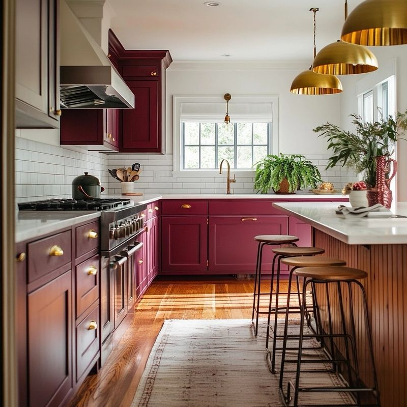
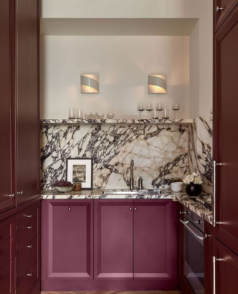
20. Burgundy
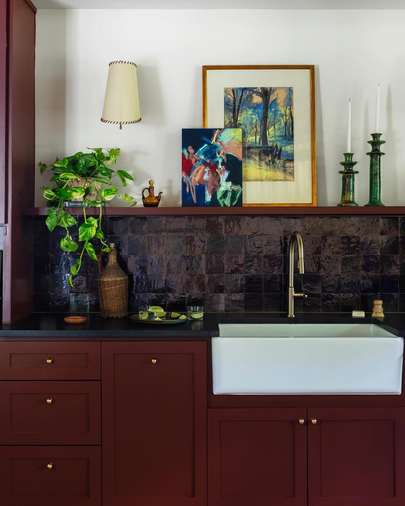
Burgundy offers depth but can make a kitchen feel dark and moody rather than inviting. It often absorbs more light than it reflects.
However, if you’re drawn to deep reds, consider softer alternatives like wine or cranberry to maintain richness without overwhelming.
Hence, choosing a lighter approach ensures your kitchen remains warm and welcoming without feeling closed in.
21. Sky Blue
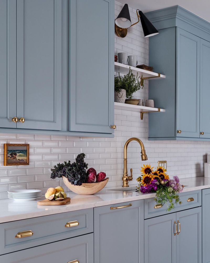
Sky blue can be refreshing, yet it often lacks the depth needed for kitchen cabinets, potentially appearing too pastel or juvenile.
If blue is your color, why not explore deeper shades like denim or steel blue for a more sophisticated appearance?
Thus, opting for a richer blue ensures a modern, stylish kitchen that remains inviting and fresh.
22. Slate Gray
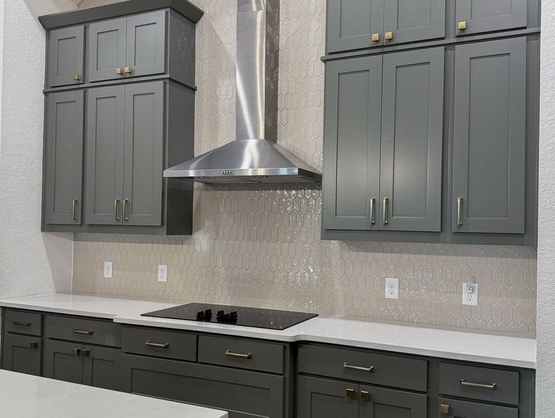
Slate gray might offer elegance, but it can also make your kitchen feel cold and uninviting. This color can sometimes lack the warmth a kitchen craves.
However, if gray attracts you, consider warmer hues like greige or dove gray to introduce a cozy touch.
Hence, choosing a warmer gray ensures your kitchen feels welcoming while maintaining a chic and modern look.
23. Cream
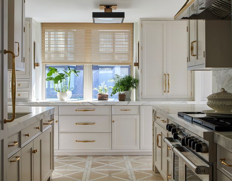
Cream might seem safe, yet it can often feel too plain for kitchen cabinets, lacking character and depth. This color might not stand out as intended.
If you desire a light tone, why not explore variations like ivory or pearl, offering subtle elegance and interest?
Thus, opting for a nuanced light color ensures your kitchen remains bright yet intriguing, full of style and grace.
24. Rust
Rust can feel rich but often reads too heavy and dated in a kitchen setting. This color can overshadow modern design elements.
However, if deep earth tones appeal, consider shades like cinnamon or clay to maintain warmth without feeling outdated.
Hence, selecting a more refined earthy tone ensures your kitchen feels both inviting and contemporary.