16 Things An Interior Designer Would Never Do In His Home
Ever wondered what interior design secrets professionals keep to themselves? While we all make decorating mistakes, expert designers have learned to avoid certain pitfalls through years of experience.
They’ve developed an eye for what truly works in a space and what will ultimately lead to regret. Let’s explore what the pros would never do in their own homes!
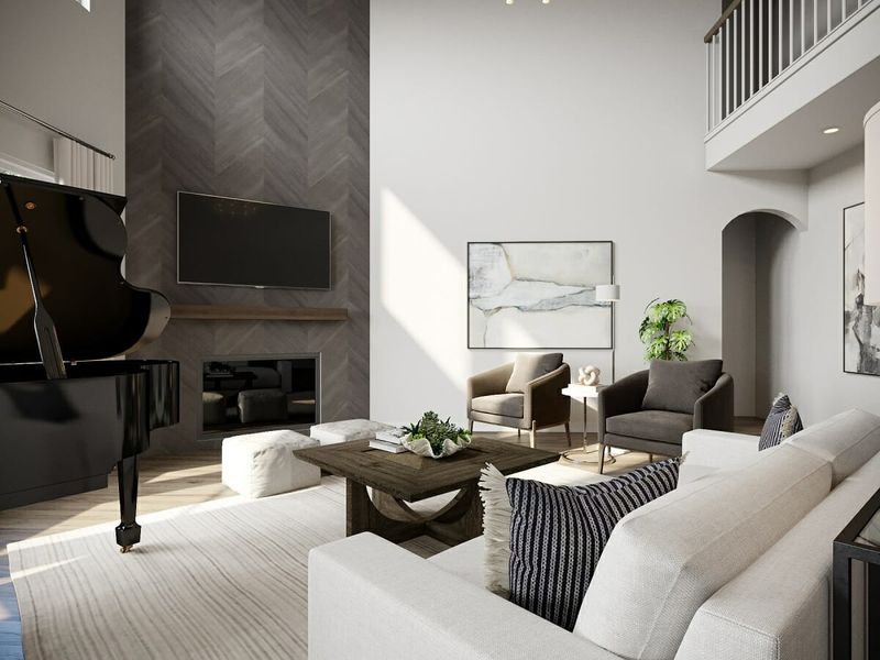
1. Skip Proper Lighting Layers
Walking into a room with just one overhead light is like eating a sandwich with only bread – bland and unsatisfying!
Professional designers understand that proper illumination requires three key layers: ambient (general lighting), task (for specific activities), and accent (to highlight features). Skipping this layered approach creates flat, uninviting spaces lacking dimension and functionality.
2. Overcrowd Rooms With Furniture
Imagine trying to navigate through a maze of coffee tables, accent chairs, and side tables just to reach the sofa! Breathing room matters as much as the furniture itself in thoughtful design.
Professionals recognize that negative space creates visual harmony and allows each piece to shine. Cramming too many items together creates chaotic energy and impedes natural movement through the space.
3. Ignore Scale And Proportion
Picture a tiny lamp perched on a massive console table – something just feels off, right? Masterful designers instinctively balance object sizes within spaces.
When furniture pieces fight for attention because they’re wildly mismatched in scale, the entire room feels disjointed. Proportional relationships between items create visual harmony that registers subconsciously as pleasing and comfortable.
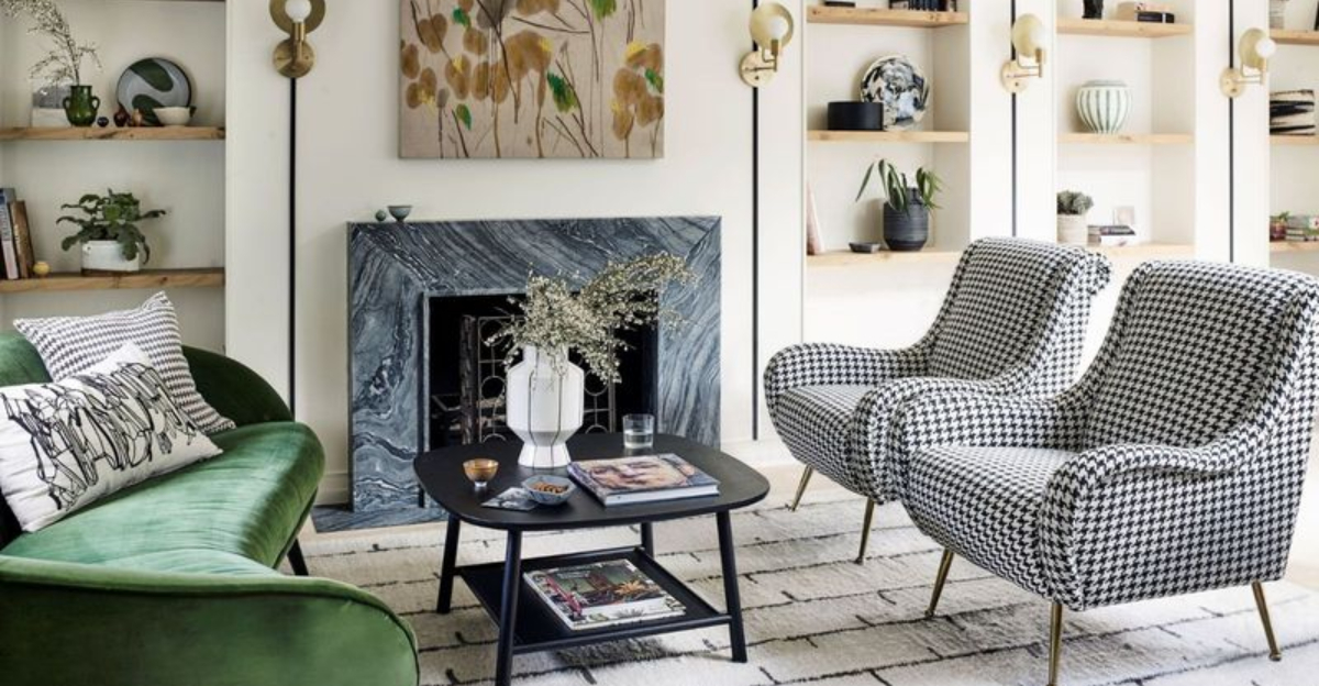
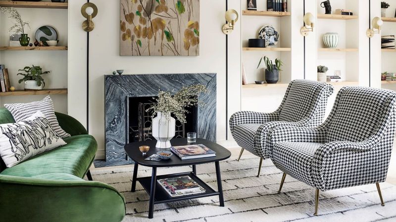
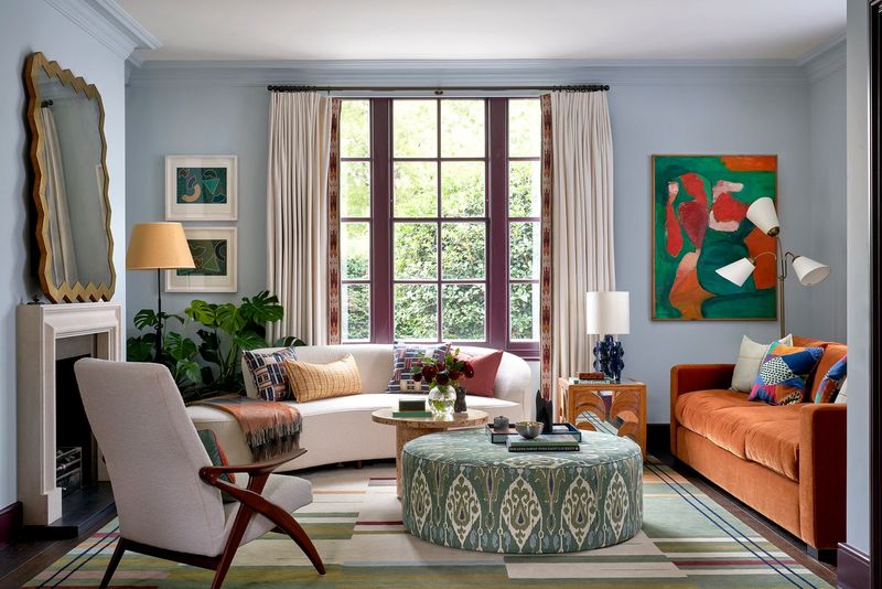
4. Use Too Many Bold Patterns At Once
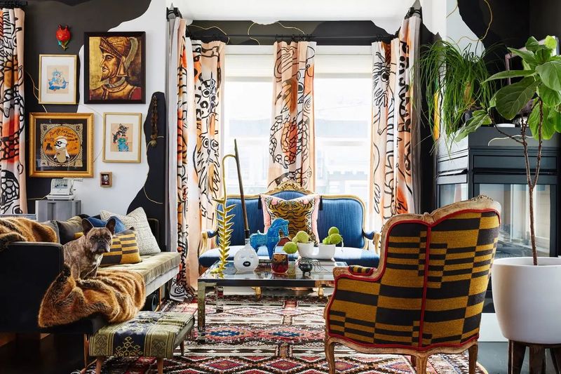
Mixing polka dots, chevrons, florals, and animal prints in one space creates visual chaos that would make even the most adventurous designer cringe!
Pattern overload competes for attention and overwhelms the senses. A more refined approach layers bold motifs with solids or quiet textures, letting standout elements breathe. When used with intention, pattern becomes punctuation—not visual noise—ensuring the space feels curated, not chaotic.
5. Neglect Storage Solutions
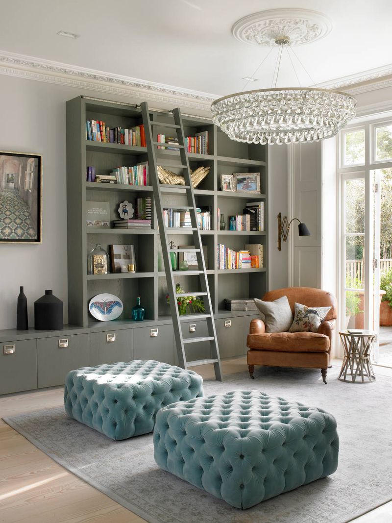
Gorgeous aesthetics mean nothing when everyday clutter has nowhere to hide! Seasoned designers know beautiful spaces must also be functional to truly enhance life quality. Without thoughtful storage integration, even the most stunning room quickly becomes a chaotic catchall.
Smart professionals incorporate attractive baskets, built-ins, and multi-purpose furniture that keeps life’s necessities accessible yet visually contained.
6. Choose Style Over Comfort
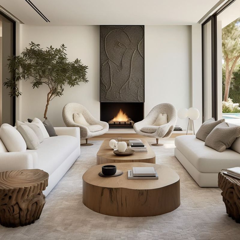
Have you ever perched uncomfortably on a stunning but rock-hard designer chair? Experienced professionals would never sacrifice livability for looks alone.
While Instagram-worthy spaces might feature sculptural seating that resembles modern art, genuine design expertise balances visual appeal with actual usability. Real designers create homes meant for living, not just admiring from a distance.
7. Forget To Incorporate Personal Touches
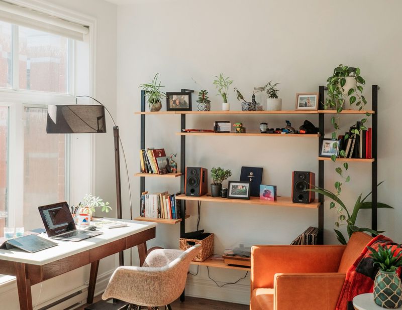
A room straight from a catalog lacks the soul that makes a house truly feel like home. Meaningful objects tell your unique story and create authentic connection to your space.
Professional designers always incorporate personal elements – family photos, travel souvenirs, or cherished heirlooms – that reflect the inhabitant’s personality and experiences. Without these meaningful touches, even the most perfectly designed room feels like a hotel rather than a home.
8. Rely Solely On Trends
Remember when chevron patterns and “Live, Laugh, Love” signs dominated every Pinterest board? Savvy designers avoid trend-chasing that leads to quick datedness and expensive updates.
Instead, professionals build rooms around timeless foundations, incorporating trendy elements only in easily changeable accents. Rushing to embrace every design fad creates spaces that feel more like time capsules than enduring, personal environments.
9. Mix Too Many Wood Tones Without Cohesion
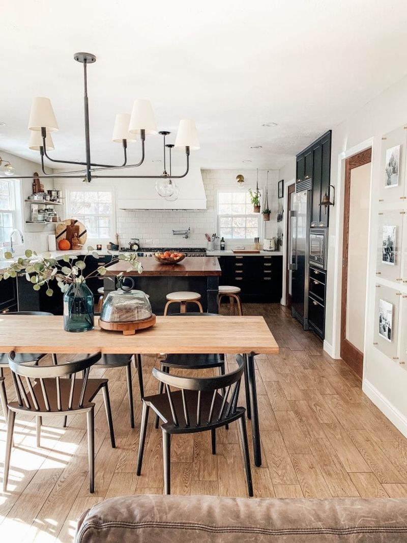
Maple floors, oak cabinets, walnut tables, and cherry accents competing in one space? Yikes! Random wood mixing creates visual discord that experienced designers carefully avoid.
Skilled professionals understand that varied wood tones can work together beautifully, but require intentional coordination. Undertones, finishes, and placement are carefully considered to create harmony—avoiding visual clutter and instead achieving a layered, thoughtful aesthetic where every wooden element feels purposeful.
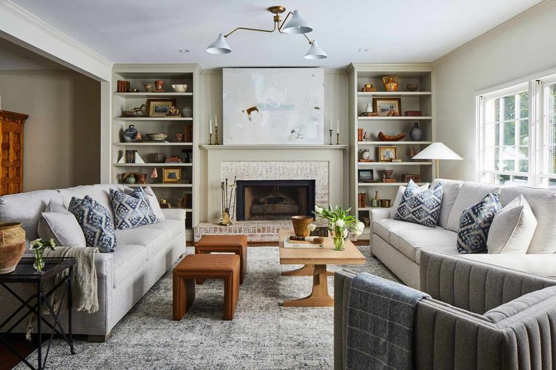
10. Overuse Matching Sets
Purchasing the entire furniture display exactly as shown in the showroom might seem convenient, but results in cookie-cutter spaces lacking personality and interest.
Creating thoughtful combinations yields spaces with depth, character and uniqueness that feel evolved over time rather than ordered from a single catalog page.
11. Disregard Traffic Flow
Constantly squeezing past furniture or bumping into corners quickly transforms beautiful rooms into frustrating obstacle courses! Smart designers prioritize movement patterns before placing a single piece.
Mapping natural pathways between doorways and high-traffic zones allows each room to flow with ease. A minimum of 30–36 inches for main walkways keeps circulation smooth and layouts feeling open, not squeezed. This thoughtful spacing supports both function and comfort without sacrificing style.
12. Hang Art Too High Or Too Low
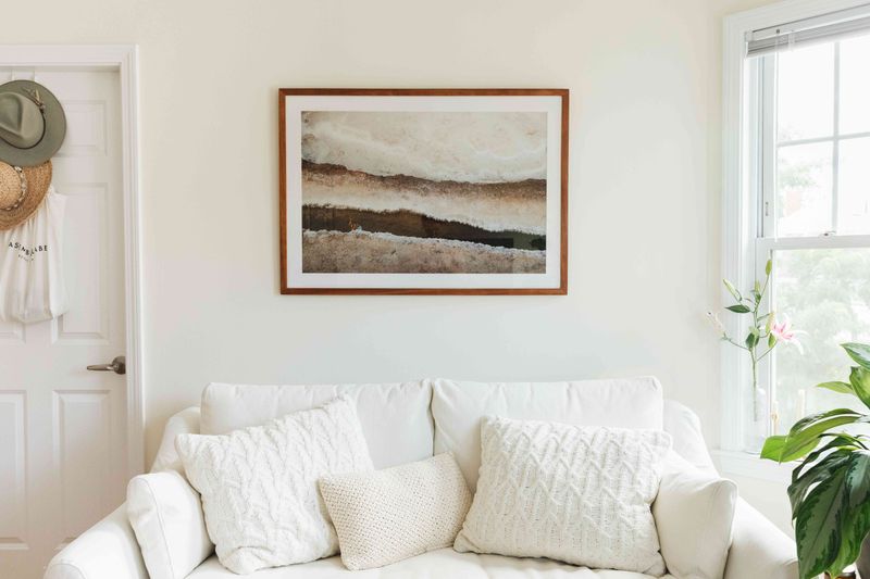
Nothing screams “amateur decorator” louder than artwork floating awkwardly near the ceiling! Seasoned designers follow the gallery standard of positioning art at eye level, typically with the center at 57-60 inches from the floor.
When hanging pieces above furniture, they maintain just 4-8 inches of space between the furniture top and frame bottom. Proper placement creates visual connection between elements rather than disjointed floating objects.
13. Skip Window Treatments
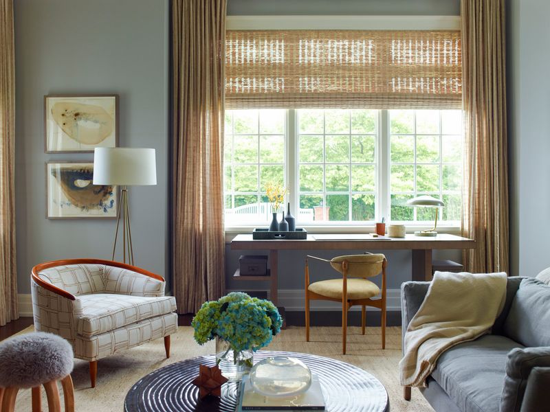
Bare windows might work in architectural magazines, but design professionals recognize that untreated glass creates unfinished spaces lacking privacy and light control. Beyond functionality, window treatments provide crucial softness through fabric, texture, and color.
Framing views like artwork, window treatments add architectural punctuation to any room. Even minimalist spaces benefit from subtle choices—sheer panels, tailored shades, or unlined linen—designed to complement clean lines without stealing focus. The result is a space that feels intentional, not unfinished.
14. Forget About Texture Variety
A room filled exclusively with smooth, shiny surfaces feels cold and unwelcoming despite perfect color coordination. Design masters deliberately incorporate varied textures that invite touch and create sensory interest.
Mixing rough with smooth, matte with glossy, and soft with structured creates depth that flat, one-note spaces lack. Visual variety through texture adds dimension even within monochromatic color schemes.
15. Neglect Quality Over Quantity
Filling spaces with numerous inexpensive, poorly made items might seem budget-friendly initially but costs more in constant replacements and diminished enjoyment. Professional designers invest in fewer, better-quality anchor pieces that withstand time and use.
Genuine materials and solid construction offer enduring value—furniture that ages with grace rather than collapses under daily life. In contrast, quick-fix pieces often betray their shortcuts with sagging cushions, chipped veneers, and wobbly joints. Long-term beauty begins with honest craftsmanship.
16. Use Poor-Quality Paint Or Finishes
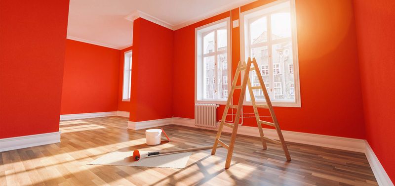
Cutting corners on wall finishes creates headaches no designer would tolerate in their own home! Quality paint offers superior coverage, durability, and color consistency worth every additional dollar. Professionals know that walls form the foundation for everything else in a room.
Premium paints with depth and richness create sophisticated backdrops that elevate an entire space—far beyond what flat builder-grade options can achieve. Subtle shifts in tone, refined finishes, and lasting pigment quality all contribute to a layered, intentional atmosphere that reads as polished rather than plain.