15 Colors Interior Designers Can’t Wait to See Gone
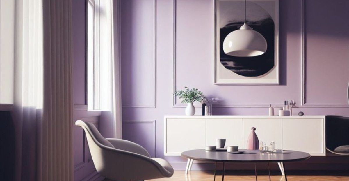
Color trends come and go, shaping the way our spaces feel and function. While some shades remain timeless, others lose their appeal, making rooms feel outdated or uninspired. Designers are now moving away from certain colors in favor of fresh, modern alternatives. Explore 15 colors losing their appeal and find out which shades can refresh and revitalize your home.
1. Avocado Green
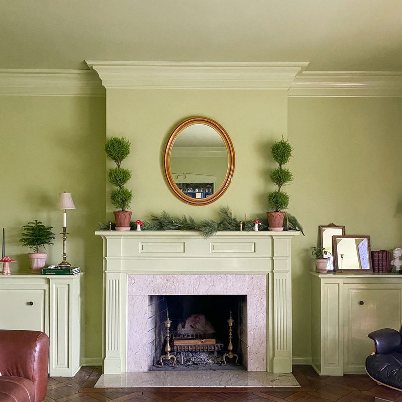
If you’ve ever walked into a home from the 70s, you might have spotted avocado green. It’s a color that screams retro, but not in a charming way.
Are you still holding onto those avocado green accents in your kitchen? It might be time for a change. Consider swapping them for a more contemporary shade like sage green.
Though avocado green had its moment, it’s no longer a favorite. The modern palette leans towards colors that are fresh and inviting, leaving avocado green in the past.
2. Tuscan Yellow
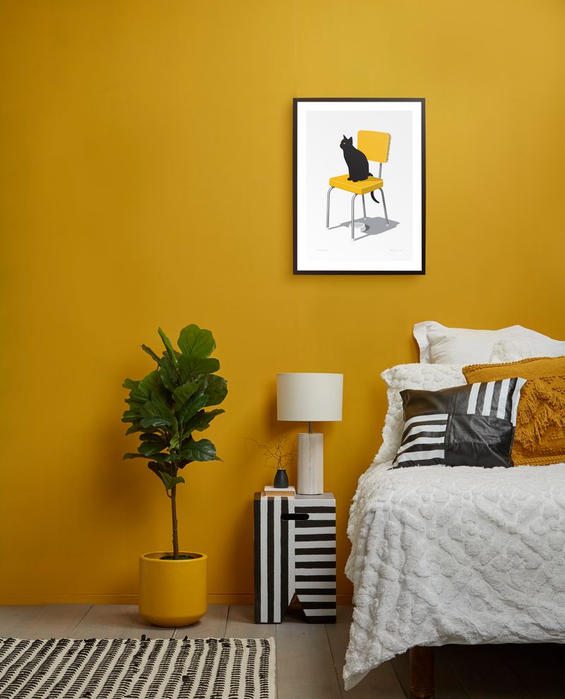
How does Tuscan yellow make you feel? It might have been warm once, but now it just feels outdated.
It’s a color that was once synonymous with elegance and warmth, especially in kitchens and dining spaces. However, tastes have shifted.
When was the last time you saw a new home featuring Tuscan yellow? That’s because designers are opting for softer, neutral tones. These colors not only brighten a space but also add a touch of modern sophistication.
3. Dusty Rose
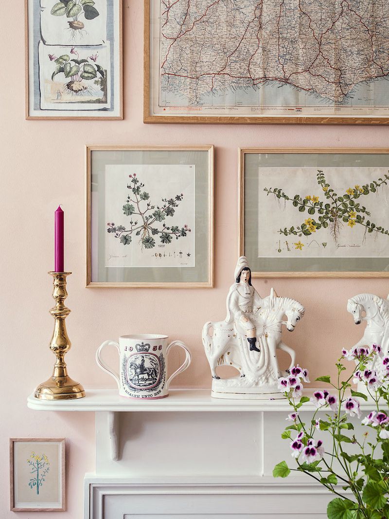
Did dusty rose ever catch your eye in a 90s catalog? It’s a color that’s hard to miss.
Are you still seeing it in your bedroom decor? Maybe it’s time to rethink. The trend has moved towards more vibrant, lively pinks.
Though dusty rose had its charm, it’s now seen as a bit tired. A fresh coat of a more energizing color can revitalize your space and bring it into the present.
4. Hunter Green
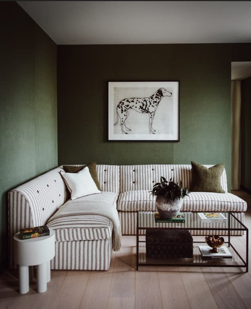
If hunter green feels heavy, you’re not alone. This deep shade that once added richness now feels oppressive.
It’s a color that might have worked well in a traditional study or library, but times have changed.
Have you noticed the shift towards lighter, airier greens? These hues are more versatile and create a more open atmosphere, making hunter green seem rather dated.
5. Terracotta
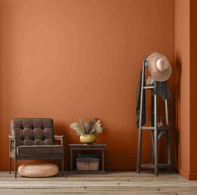
Is terracotta still in your dining room? It might be time to reconsider.
This earthy tone was once the go-to for adding warmth, but now it feels a bit too heavy.
There’s been a shift towards lighter, more modern earth tones that offer the same warmth without the weight. Consider making a change if you want to keep your space current.
6. Mauve
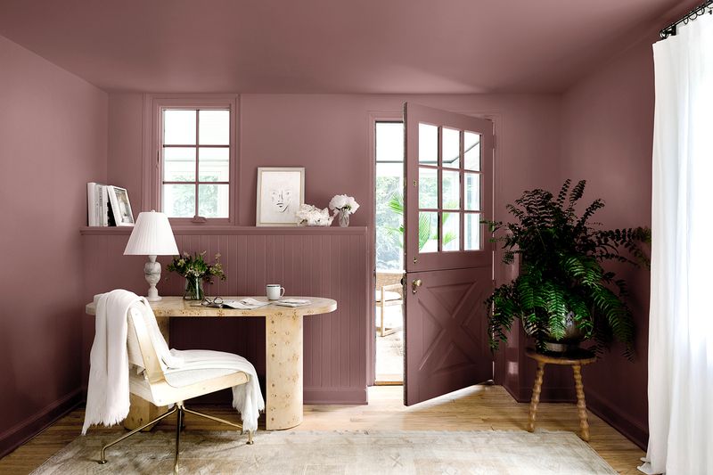
Are you still drawn to mauve? It might be time to let go.
This soft, muted purple once brought elegance, but it now seems stuck in the past.
Have you seen how designers are embracing bolder purples and lavenders? These options breathe new energy into a space, leaving mauve feeling rather forgotten.
7. Peach
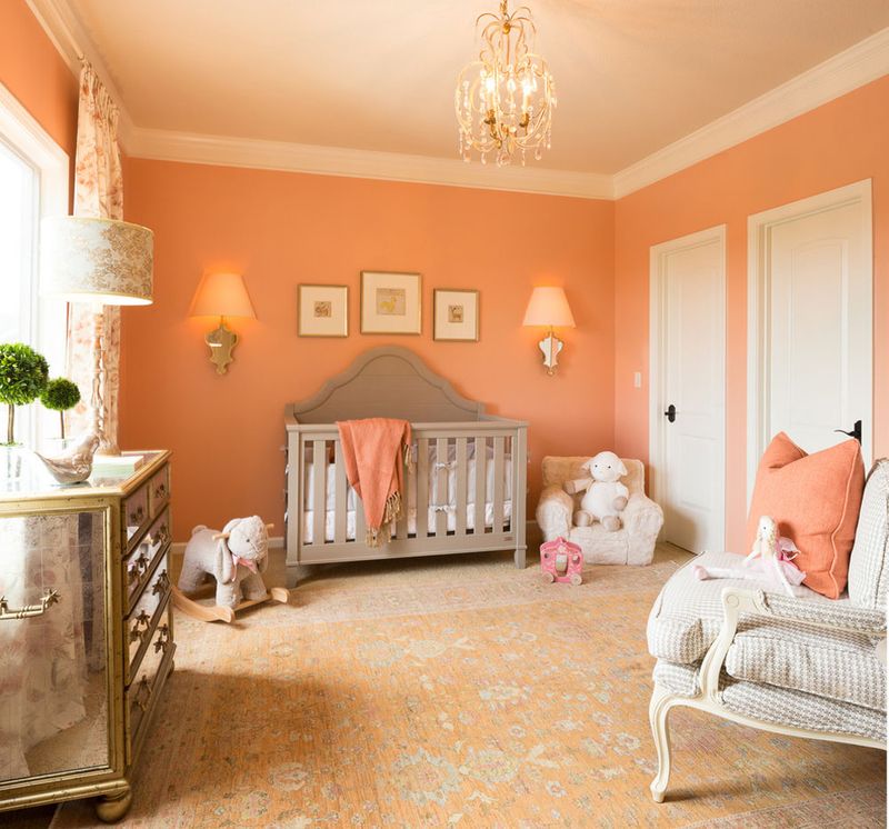
When did peach last make you feel inspired? For many, it’s been a while.
This once-popular pastel has lost its luster, giving way to more dynamic shades.
Consider how a brighter or more subdued alternative can transform your space. Peach feels a bit too nostalgic these days, and a refresh might be in order.
8. Navy Blue
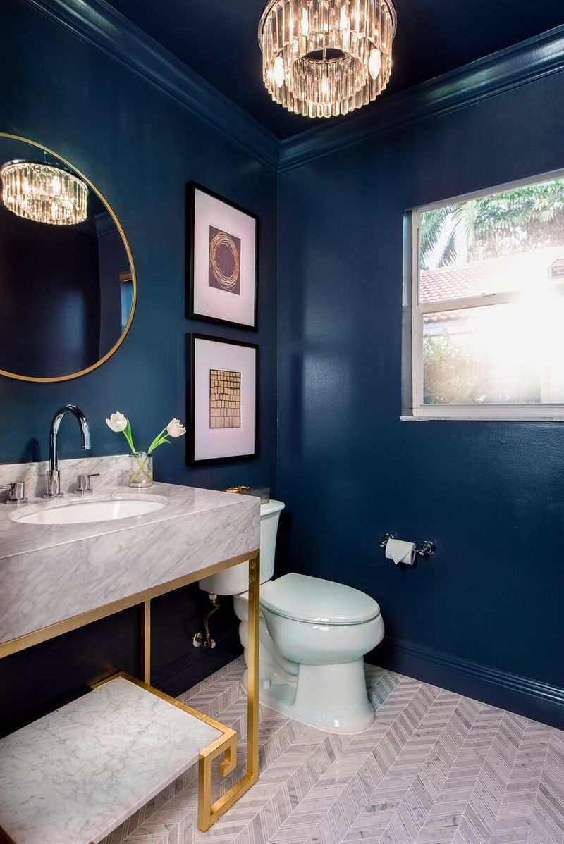
Though navy blue has been a classic, it might feel too strong now.
Where navy once added depth, it’s now being replaced with softer blues.
When did you last see a fresh space featuring navy as a dominant color? The trend is shifting towards hues that offer tranquility without the weight.
9. Burgundy
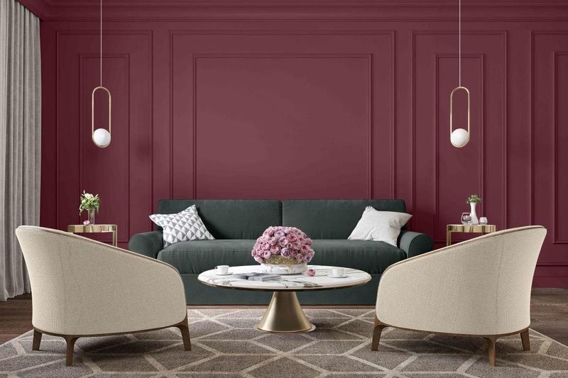
If burgundy still dominates your space, it might feel overwhelming.
This deep, rich color was once a staple, but now it’s being phased out.
Are you ready for a change? Opt for lighter reds or even experiment with shades of wine for a modern touch.
10. Lime Green
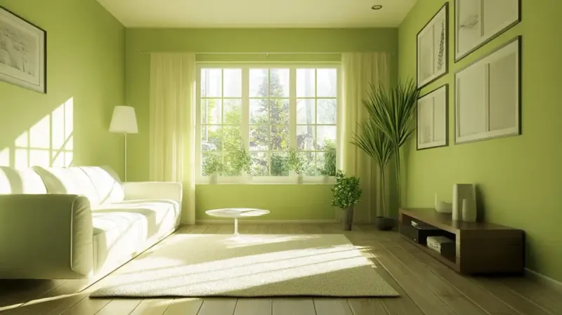
When was lime green last a designer favorite? It’s been a while.
This bold and bright color has been overshadowed by more subtle, sophisticated greens.
Consider how a muted or slightly darker green could add a modern flair to your space, leaving lime green behind in the past.
11. Powder Blue
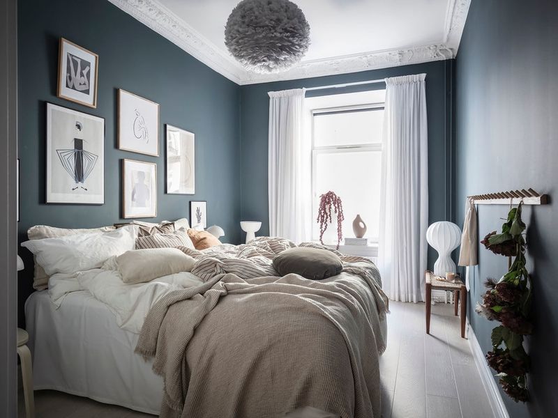
Did powder blue once charm you? Its soft and gentle hue was appealing.
Now, however, it’s seen as a bit too bland for modern tastes.
Think about revitalizing with more blues or even soft teals. These colors offer the same calmness with added depth and interest.
12. Beige
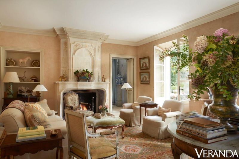
Beige, once the ultimate neutral, may now feel a bit uninspired.
Are your beige walls lacking depth? They can sometimes seem too plain, blending into the background without adding much character.
Consider warmer earth tones or soft grays for a fresh, modern update. A subtle shift in color can make all the difference, adding personality while keeping things timeless.
13. Coral
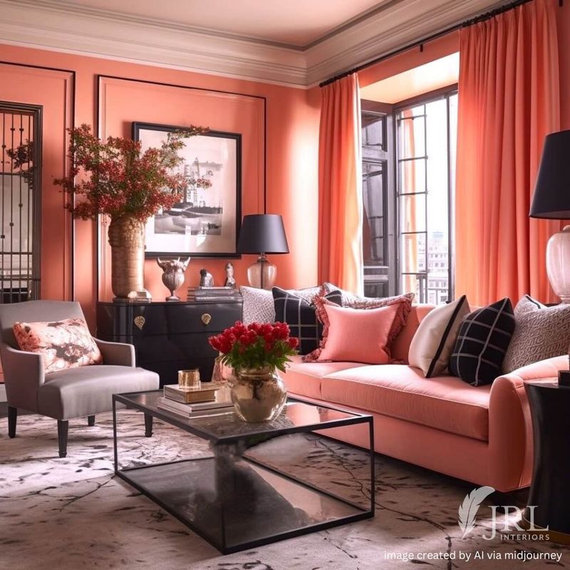
Coral once made a bold statement, but now it can feel a bit overpowering.
Have you noticed the growing preference for softer, more calming tones? Bright hues are taking a step back in favor of shades that create a relaxed atmosphere.
A muted orange or a gentle pink can refresh your space, adding warmth without overwhelming the room.
14. Lilac
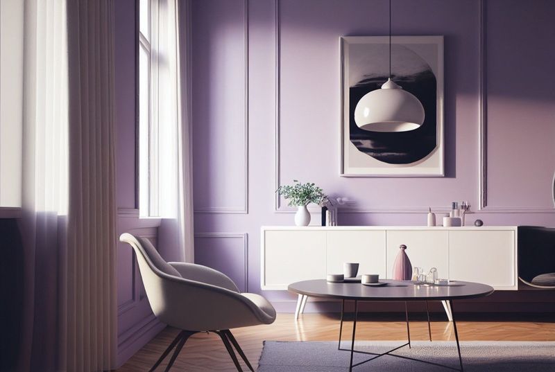
Lilac once had its charm, but now it can feel a bit dated.
Are you noticing a shift toward richer, more modern hues? Softer pastels are making way for deeper purples and versatile neutrals.
A saturated violet or a subtle gray can refresh your space, keeping it elegant and current.
15. Mustard Yellow
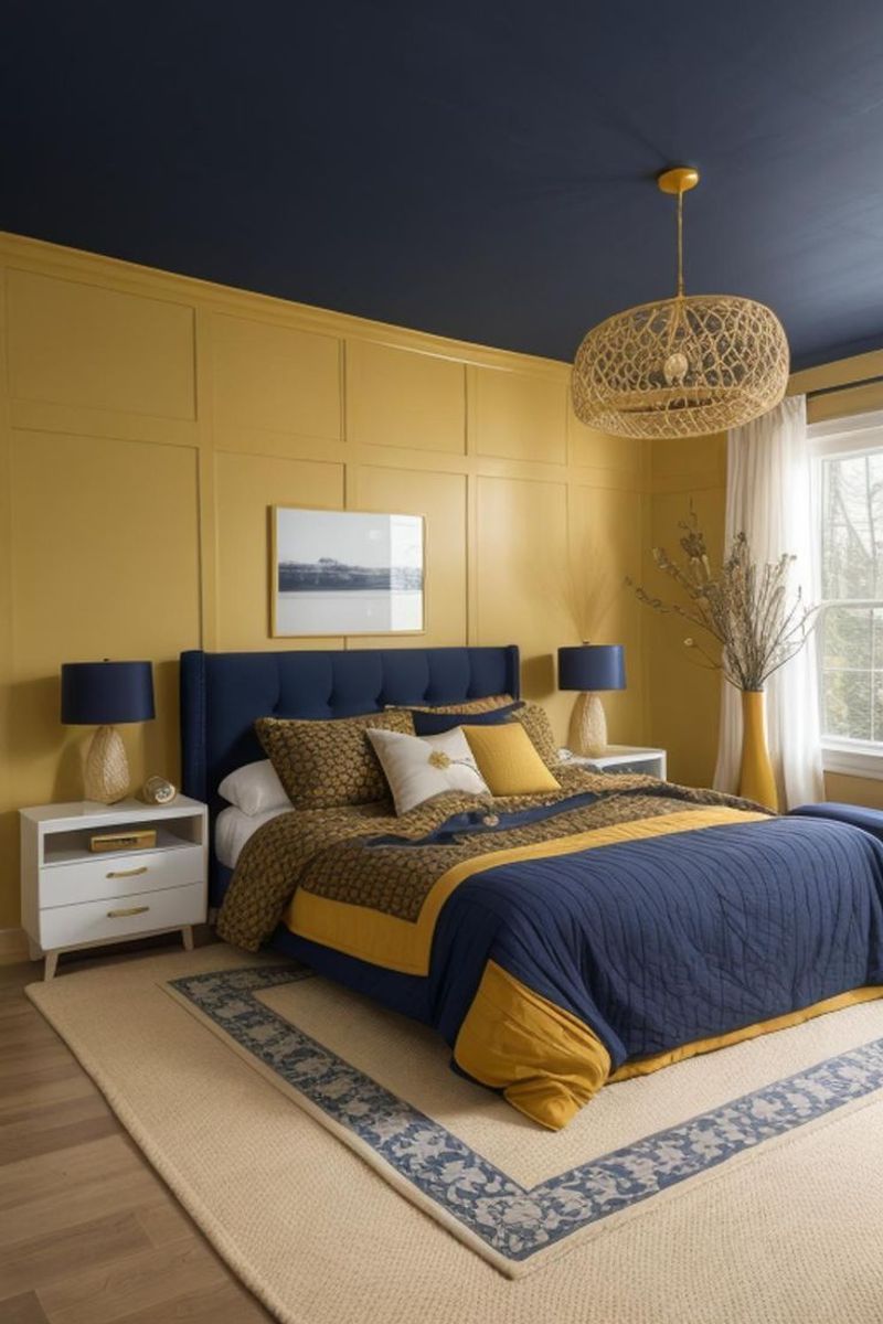
Mustard yellow had its time, but it’s not a color that resurfaces often.
Do you feel like it’s starting to overwhelm the room? What once brought cheer now feels a bit too bold and heavy.
Opt for lighter yellows or elegant golds to add warmth and brightness without the intensity. Let mustard yellow make its exit and embrace a softer approach.
