17 Color Rules The Property Brothers Never Break For Stylish, Timeless Homes
The Property Brothers, Drew and Jonathan Scott, have transformed countless homes with their signature style and expert eye for color. When it comes to creating spaces that feel both current and classic, they rely on tried-and-true color principles that stand the test of time.
Looking to give your home that professional designer touch? Here are the color rules these HGTV stars swear by.
1. Balance Bold Shades With Neutrals
Falling in love with that vibrant emerald green? Go ahead and use it, but pair it with calming beiges or soft grays to keep the room from feeling overwhelming.
When bright colors have neutral companions, they shine without shouting. Just like the Property Brothers often demonstrate, this balance creates spaces that feel both exciting and livable.
2. Always Test Paint In Natural Light
What looks perfect under store lighting might reveal surprising undertones once on your walls at home. Smart homeowners follow the Brothers’ advice by testing paint samples in different parts of the room.
Morning light versus evening light can transform colors dramatically. A small investment in sample pots saves heartache and expensive repainting later.
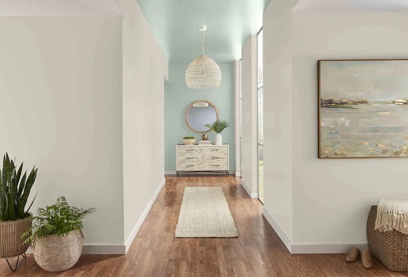
3. Keep Ceilings Lighter Than Walls
Rooms instantly feel more spacious and airy when ceilings are painted lighter than walls. Jonathan often recommends this trick for creating visual height even in modest spaces.
Light bounces off pale ceilings, eliminating that cramped, boxed-in feeling. People mistakenly paint everything the same shade, missing this opportunity to expand their space visually.
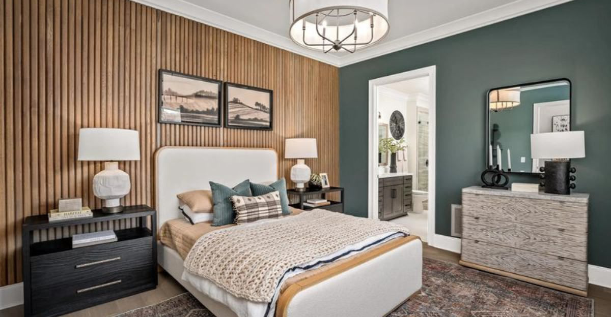
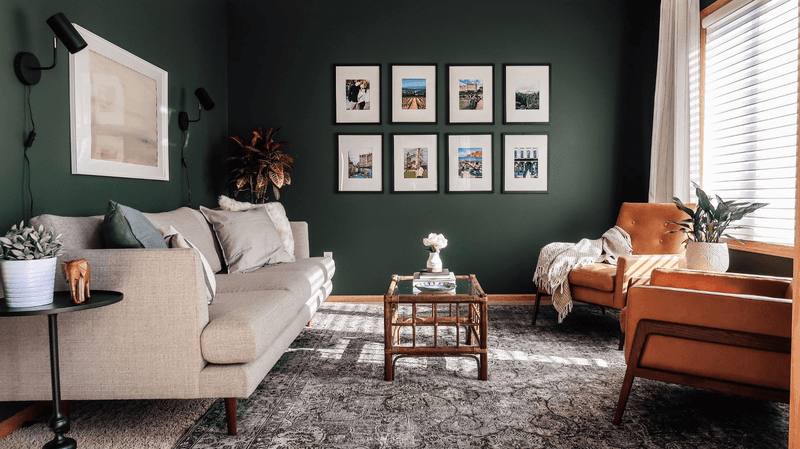
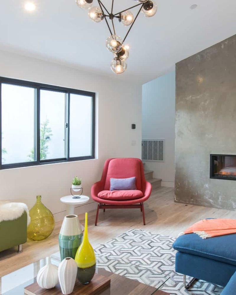
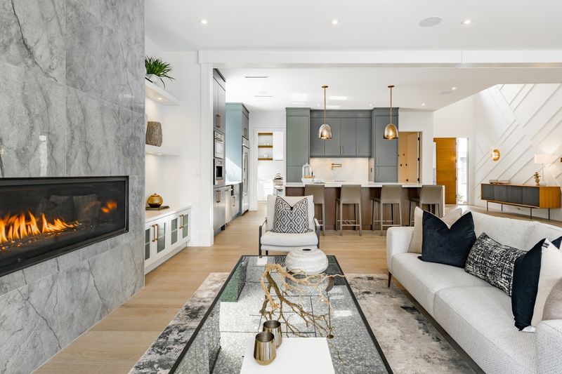
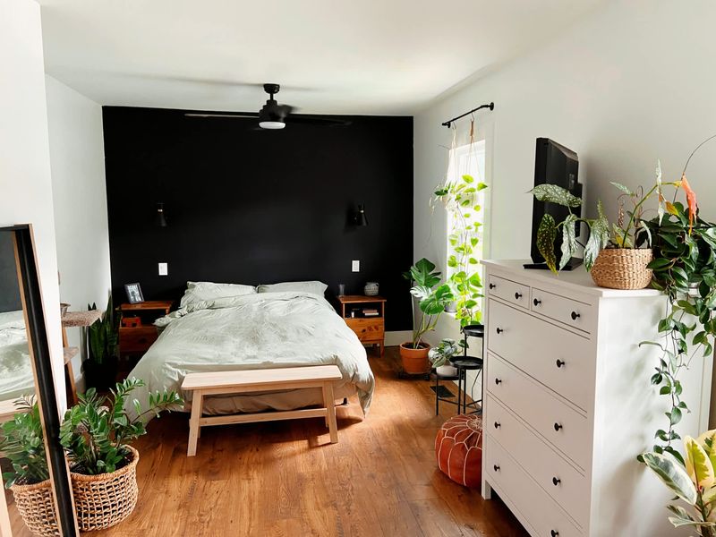
4. Use One Dark Accent For Depth
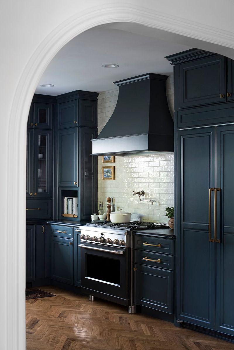
Introducing just one darker element prevents rooms from feeling flat and two-dimensional. Maybe it’s a navy blue island in a white kitchen or a charcoal accent wall behind the bed.
Visual interest comes from contrast, not complexity. Drew frequently points out how this single darker element anchors a space while maintaining the clean, uncluttered aesthetic the Brothers are known for.
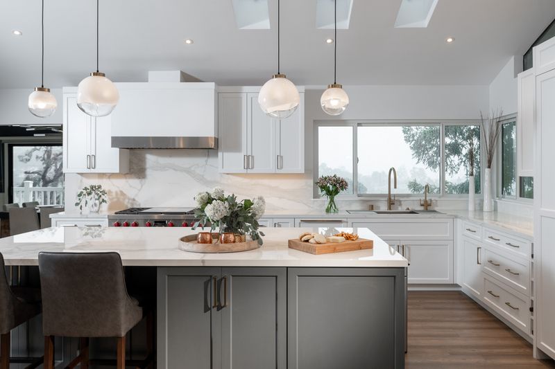
5. Stick To A Three-Color Palette
Limiting your palette creates cohesion without boredom. Professional designers like the Scott brothers typically select one neutral base, one complementary color, and one accent shade that pops.
Amateurs often make the mistake of including too many competing colors. By embracing restraint, each shade gets to play its proper role without fighting for attention in the overall design.
6. Layer Warm And Cool Tones Carefully
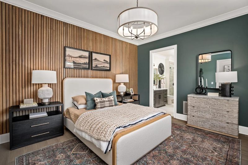
Mixing temperature tones creates dimension but requires finesse. Jonathan might pair cool gray walls with warm wood floors and brass fixtures for balance.
When done thoughtfully, this interplay prevents spaces from feeling either too sterile or too heavy. Most amateur decorators lean too far in one direction, missing the sophisticated middle ground that makes Property Brothers designs feel so inviting.
7. Match Undertones Across Materials
Rookie mistake alert! Grabbing paint, tile, and countertops without checking undertones leads to clashing combinations. Drew always emphasizes comparing samples side-by-side in natural light.
Yellow-based beiges fight with pink-based beiges even though both are technically neutral. Successful rooms maintain consistent undertones throughout different materials, creating that seamless look the Brothers consistently deliver.
8. Add Pops Of Color Through Accessories
The brothers suggest keeping walls and major furniture neutral while introducing color through items you can easily change.
Pillows, artwork, and decorative objects bring personality without permanence. Seasonal refreshes become simple when your color foundation stays flexible, allowing you to follow trends without major renovations – a budget-friendly approach the Brothers champion.
9. Let Flooring Guide Wall Color
Starting with fixed elements saves headaches later. Since flooring is expensive to change, select it first, then choose wall colors that complement it perfectly.
Walls are relatively easy to repaint, while floors represent a significant investment. By building your color scheme from the ground up, you’ll achieve that thoughtfully coordinated look that distinguishes amateur efforts from professional designs.
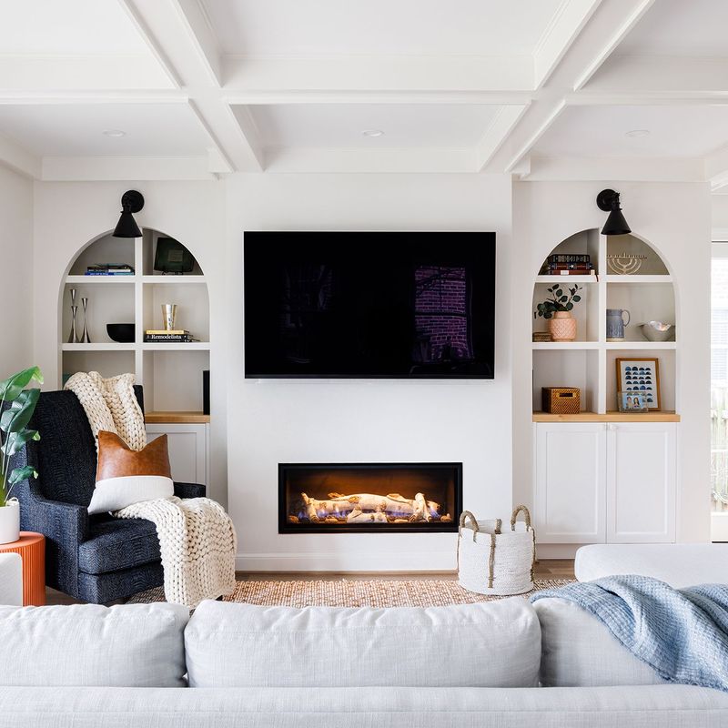
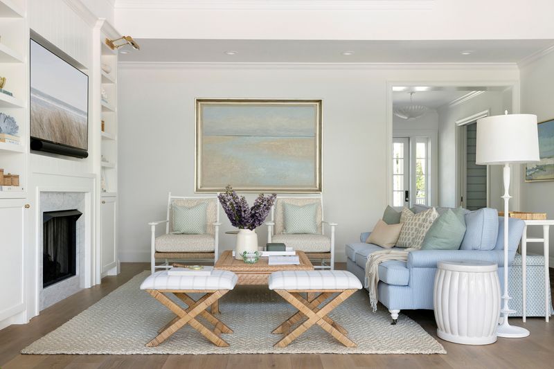
10. Use White To Create Breathing Space
Visual rest areas prevent sensory overload in colorful rooms. Include white elements to give the eye a place to pause amid more vibrant design choices.
White trim, shelving, or furniture pieces create natural breaks in the color story. Much like punctuation in writing, these white moments help articulate the design without letting it run together into visual chaos.
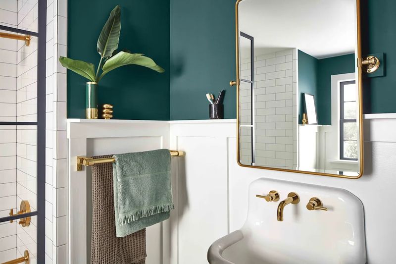
11. Go Softer In Small Rooms
Cramped spaces expand visually with lighter, softer hues. Drew often suggests pale blues, gentle greens, or soft lavenders for compact bathrooms and bedrooms.
Muted tones create the illusion of receding walls, making tight quarters feel more generous. While bold colors can work anywhere with proper execution, the Brothers typically reserve stronger shades for rooms with breathing room.
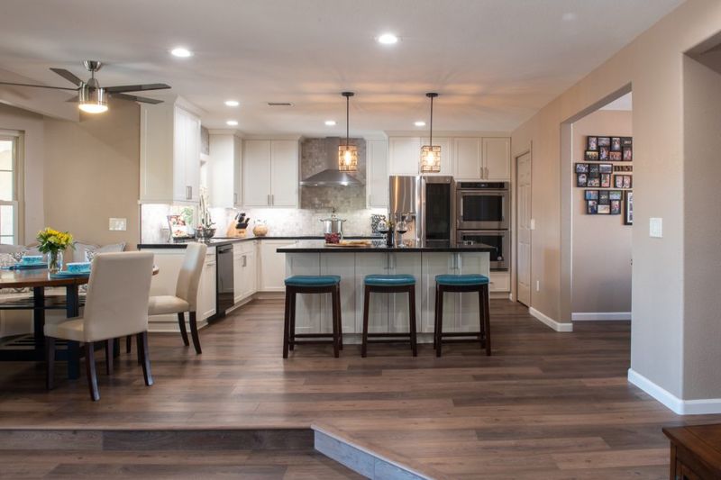
12. Anchor Open Spaces With Consistent Colors
Modern open floor plans need cohesion to avoid feeling disjointed.
Perhaps the kitchen backsplash tile color reappears in living room accent pillows. By threading consistent hues throughout open spaces, the Brothers create flow while still allowing each area to maintain its distinct purpose.
13. Highlight Architecture With Contrasts
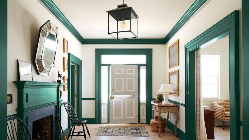
Crown molding, wainscoting, and built-ins deserve attention! We can emphasize these features by painting them in contrasting colors from surrounding walls.
Architectural details fade into obscurity when everything’s the same shade. By giving these elements their moment to shine through strategic color differences, the Brothers add character and dimension that elevates ordinary rooms to designer showcases.
14. Blend Seamlessly From Room To Room
Color transitions between spaces should feel natural, not jarring. Rather pick shades from the same color family for adjacent rooms visible to each other.
Walking through a home should feel like turning pages in a well-written story, not jumping between different books. Successful color flow creates that pulled-together look that distinguishes professionally designed homes from DIY projects.
15. Use Matte Finishes For Cozy Vibes
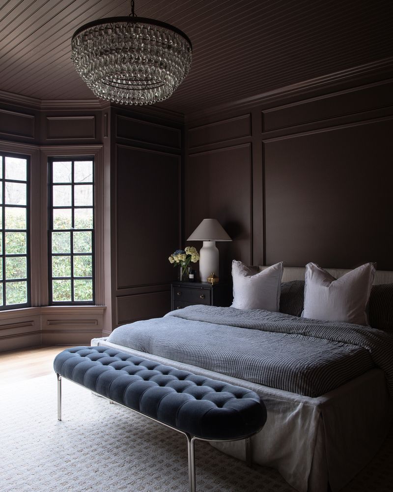
Paint sheen dramatically affects how color feels in a space. The brothers gravitate toward flat or eggshell finishes for living areas and bedrooms to create warmth and intimacy.
Matte surfaces absorb light rather than reflecting it, softening the overall mood. While not practical for high-traffic or moisture-prone areas, these low-luster finishes excel at creating those comfortable, relaxed environments the Brothers are famous for.
16. Gloss Finishes To Reflect Light
Small or dark spaces benefit from strategic shine. Sometimes we can go with semi-gloss or satin paint for rooms lacking natural light, as these finishes bounce available illumination around the space.
Bathrooms and kitchens gain practical benefits too, glossier paints stand up better to moisture and cleaning. By reserving reflective finishes for specific applications, the Brothers balance practicality with aesthetic considerations.
17. Never Forget The Power Of Black
Just a touch of black grounds any color scheme with sophistication. Drew incorporates small black elements: picture frames, hardware, or light fixtures, even in otherwise light rooms.
Black creates focal points that draw the eye exactly where you want attention. Many homeowners shy away from this dramatic neutral, but the Brothers embrace its ability to add instant polish to any space.