17 Paint Colors You Should Never Use For Your Front Door
Your front door makes the first impression of your home, setting the tone for what lies beyond. Choosing the right color can enhance curb appeal and reflect your personal style.
However, some paint colors can clash with your home’s architecture, create maintenance issues, or simply turn potential visitors away.
1. Neon Yellow
Looking for a way to blind your neighbors? Neon yellow might do the trick! This eye-searing shade not only fades quickly in direct sunlight but also clashes with nearly every home exterior style imaginable.
Your visitors will need sunglasses just to knock on your door, and real estate agents will cringe at the resale implications.
2. Bright Orange
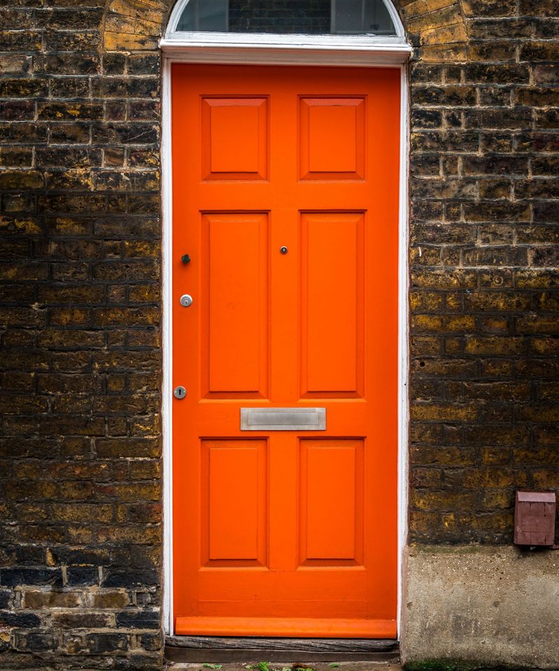
Unless you’re running a pumpkin patch or celebrating Halloween year-round, bright orange creates a startling focal point for all the wrong reasons.
The intense hue absorbs heat in summer months, potentially warping your door over time. While some muted oranges can work beautifully, the traffic-cone variety screams “look at me” with the subtlety of a foghorn.
3. Matte Black
Surprised to see this trendy color listed? While matte black can look sophisticated, it shows every fingerprint, dust particle, and water spot with alarming clarity.
In hot climates, matte black absorbs heat intensely, making your door too hot to touch during summer months. Maintenance becomes a daily chore rather than an occasional touch-up.
4. Fluorescent Pink
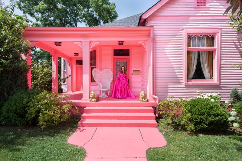
Want your house to look like a life-sized Barbie dream home? Fluorescent pink might accomplish that goal!
Beyond the obvious eyesore factor, this intense color fades unevenly in sunlight, leaving patchy, washed-out areas that require frequent repainting. Homeowners’ associations typically have this shade at the top of their banned list for good reason.
5. Muddy Brown
Attempting to blend with nature? Muddy brown achieves the opposite effect by making your entrance appear perpetually dirty and unwelcoming.
Rather than warm and earthy, this flat, dull shade lacks dimension and can make even the most architecturally interesting door look flat and lifeless. Actual dirt and grime become nearly invisible, hiding cleanliness issues.
6. Dull Gray
Imagine walking up to a door that perfectly captures the feeling of a rainy Monday morning. That’s dull gray for you! While sophisticated grays exist, the flat, primer-like version creates a depressing, institutional feel that suggests neglect rather than intentional design.
On cloudy days, your entrance practically disappears, lacking any visual interest or appeal.
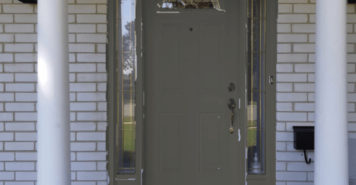
7. Olive Green
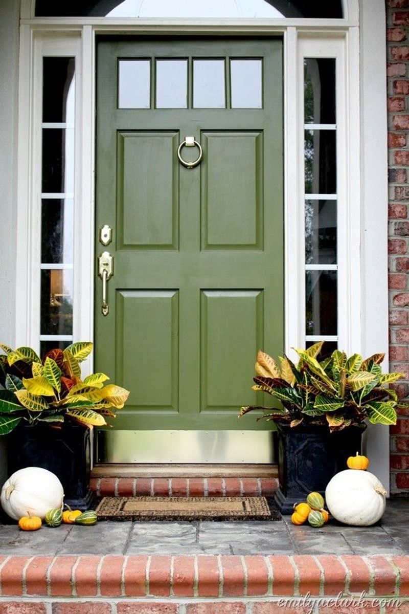
Reminiscent of 1970s appliances, olive green carries a dated feel that can drag down your home’s exterior. Over time, this already-muddy shade tends to fade into an even less appealing yellowish-brown, especially in sunny locations.
Combined with brick exteriors, it creates a clash that makes design-conscious visitors want to run in the opposite direction.
8. Pastel Purple
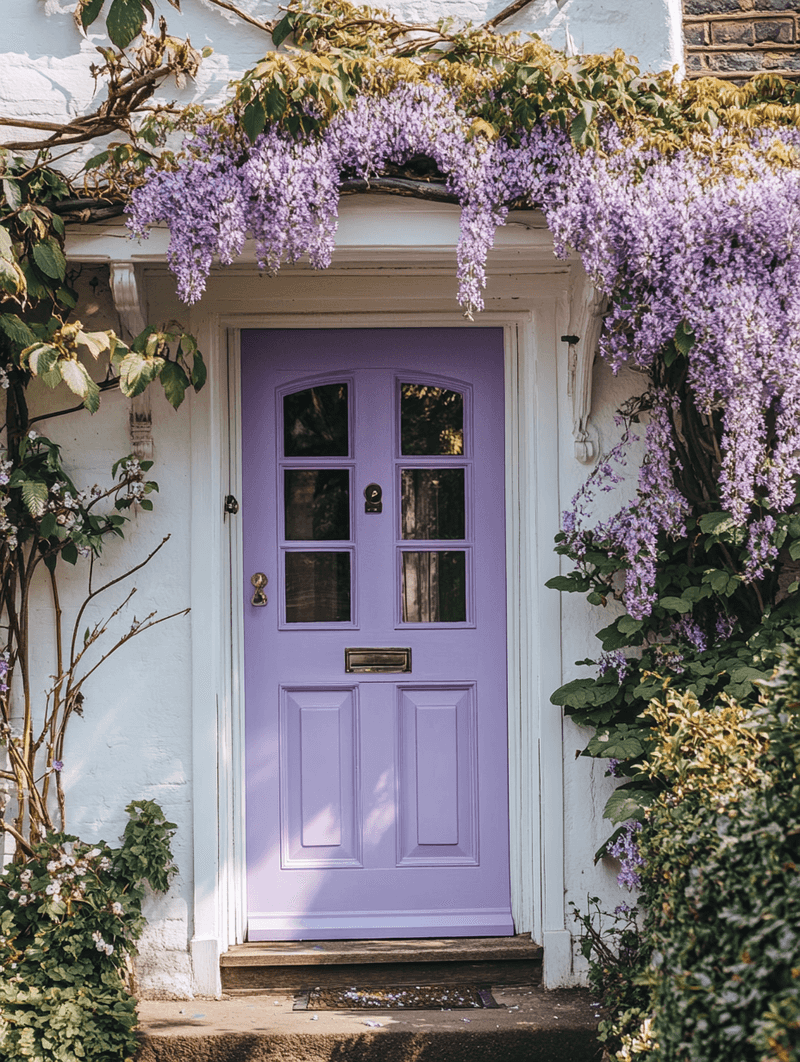
Feeling whimsical? Pastel purple might seem charming initially but quickly becomes the neighborhood oddity. Sunlight exposure transforms this color into a strange grayish-lavender that appears dirty rather than intentional.
Most home exteriors simply don’t have complementary elements to make this color work, leaving it looking out of place and childish.
9. Dirty White
Why paint your door to look perpetually filthy? Off-white with yellow or gray undertones creates this unfortunate effect.
Dirty white shows actual dirt magnificently while simultaneously looking dingy from day one—achieving the impressive feat of being both high-maintenance and unattractive.
10. Rust Red
Ironically named, rust red actually resembles actual rust—not exactly the message you want to send about home maintenance! This muddy, oxidized shade lacks the vibrancy of true reds while still drawing significant attention to itself.
Worse yet, when it inevitably fades, it transforms into an even less appealing brownish-orange that looks like genuine deterioration.
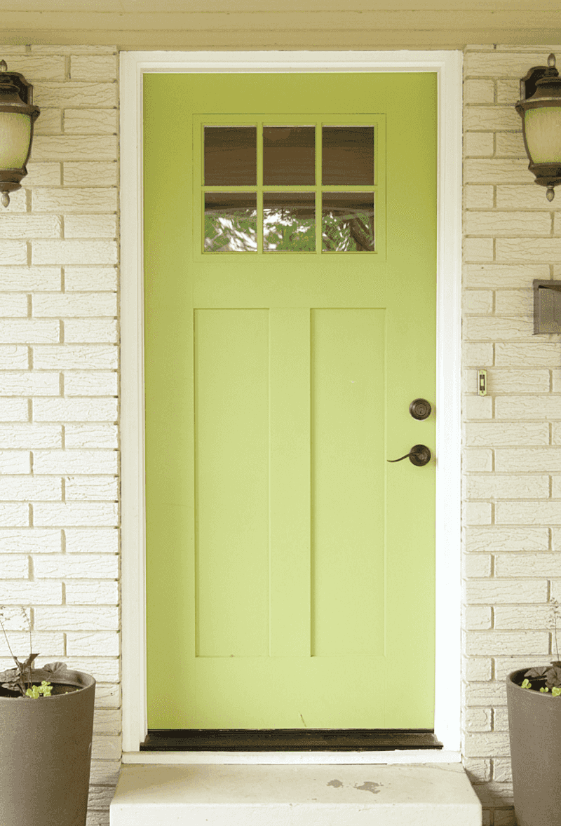
11. Neon Green
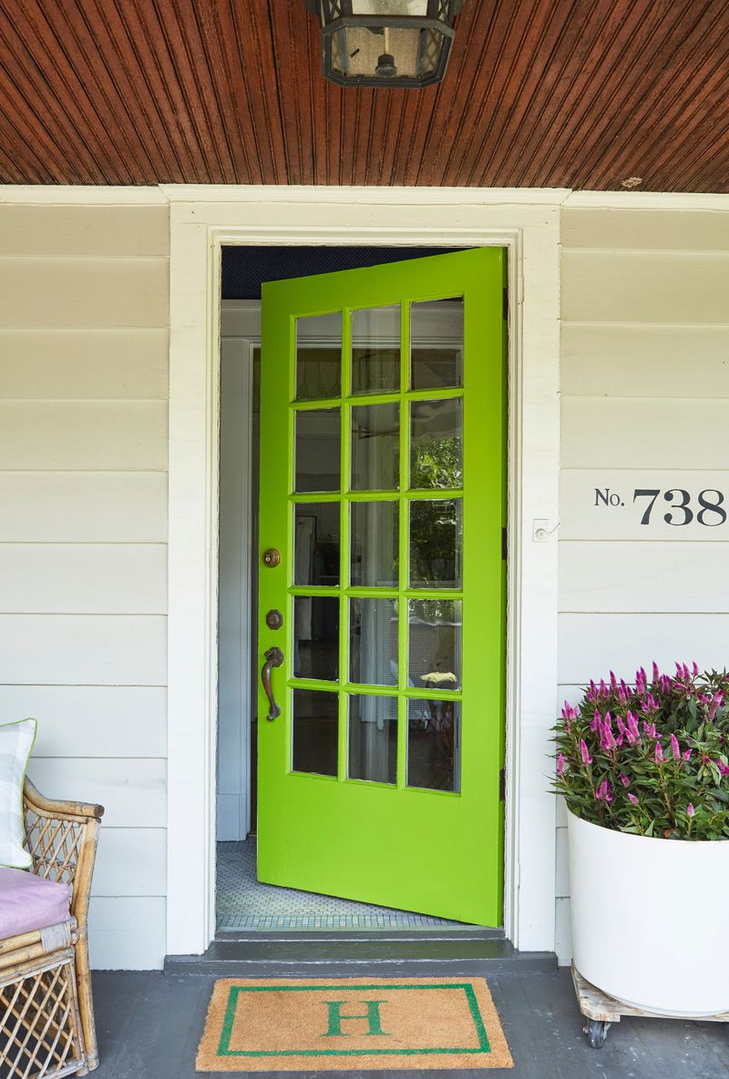
Hoping to recreate the aesthetic of a monster energy drink can? Neon green accomplishes this questionable goal perfectly!
Beyond being visually aggressive, this color reflects green light onto your entryway, casting an unflattering alien glow on everyone who visits. Neighbors will wonder if you’re running a haunted house or simply lost a bet.
12. Dark Purple
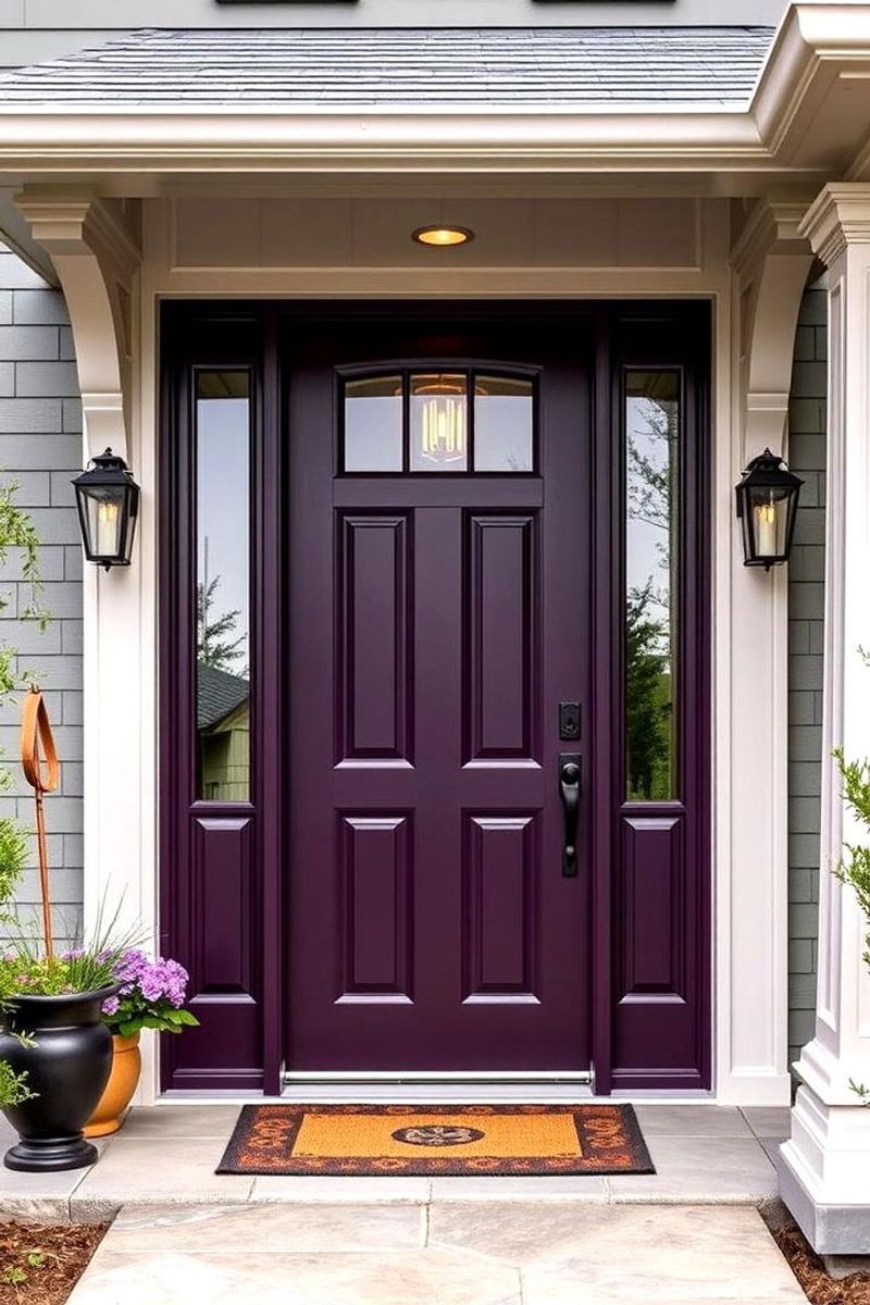
Aspiring to gothic drama? Dark purple might seem sophisticated but quickly absorbs heat, potentially causing warping and paint bubbling in warm climates.
Sunlight exposure fades it unevenly into a patchy, bruise-like appearance that’s anything but elegant. Maintenance becomes a nightmare as touch-ups rarely match the faded portions, creating a mottled effect.
13. Faded Blue
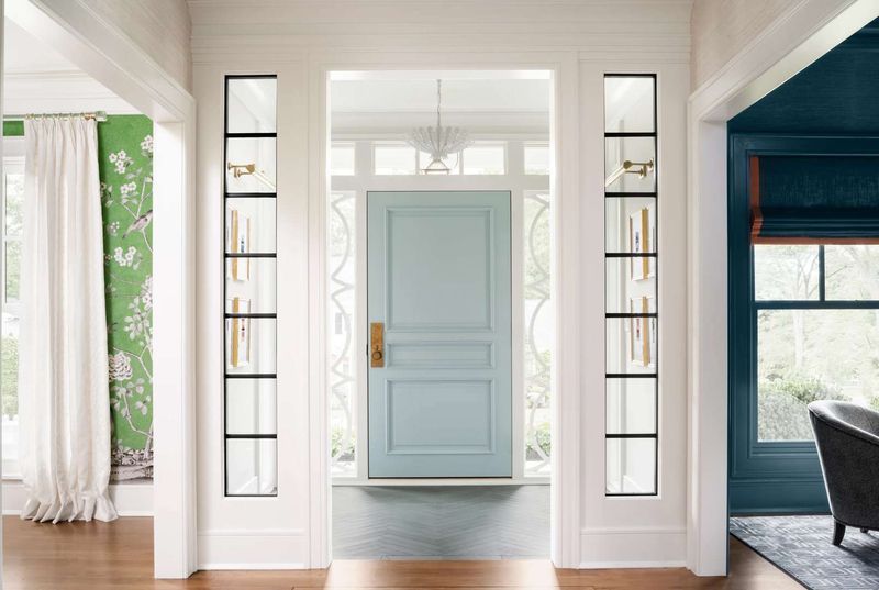
Picture the color of old, worn-out jeans that should have been retired years ago. That’s faded blue on your front door!
Neither vibrant enough to make a statement nor neutral enough to blend in, this wishy-washy shade suggests indecision and neglect. Over time, it continues fading into an even less appealing grayish tone that looks perpetually dirty.
14. Mustard Yellow
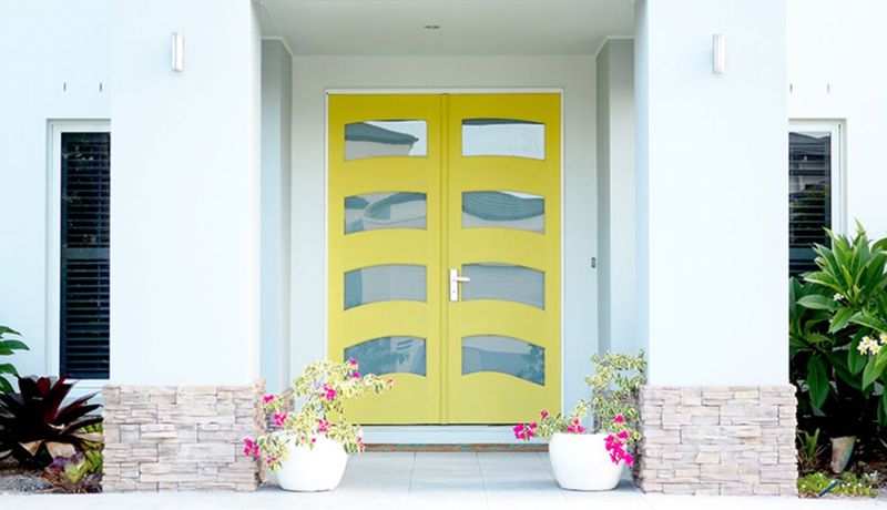
Reminiscent of 1970s kitchen appliances, mustard yellow creates an instantly dated look that’s hard to coordinate with any exterior. Sunlight exposure only intensifies the problem, turning this already-questionable shade into something resembling old, congealed condiments.
Visitors might wonder if your color choice is intentional or the result of decades of neglect and cigarette smoke.
15. Glossy Beige
Seeking the excitement of watching paint dry? Glossy beige delivers this thrilling experience permanently!
The high-shine finish only emphasizes the utter blandness of the color, creating a corporate, builder-grade appearance that screams “I put zero thought into this decision.” Dirt shows dramatically against the glossy surface, requiring constant cleaning to maintain its uninspiring appearance.
16. Overly Bright Red
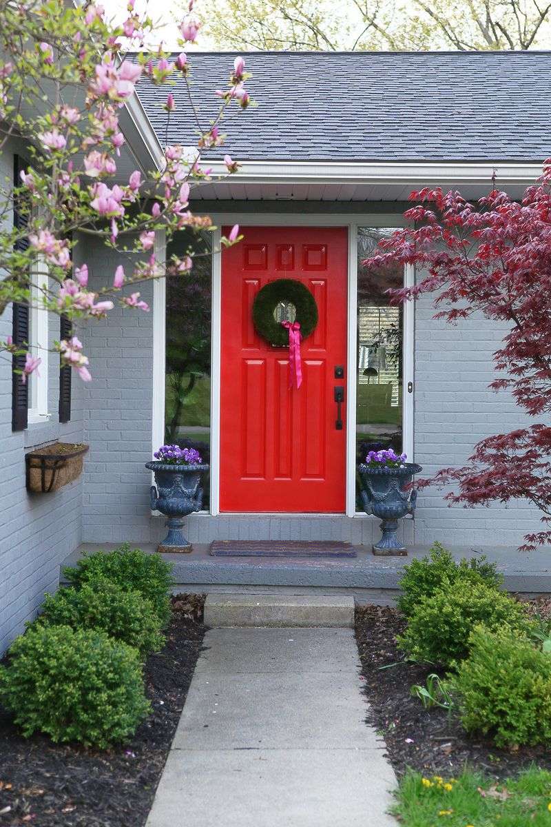
Fire engine red might seem classic, but the ultra-bright version quickly becomes the neighborhood eyesore. Sun exposure causes this intense pigment to fade dramatically and unevenly, often turning pinkish in patches within the first year.
Maintenance becomes a constant battle as touch-ups rarely match, creating a door that looks perpetually half-repainted.
17. Pea Green
Reminiscent of baby food or something even less appetizing, pea green creates an instantly nauseating first impression. This sickly shade tends to yellow over time, transforming into something even more questionable with age.
Combined with most brick or stone exteriors, it creates a clash so visually jarring that delivery drivers might leave packages at the curb.