20 Bookshelf Styling Mistakes That Can Ruin Your Space
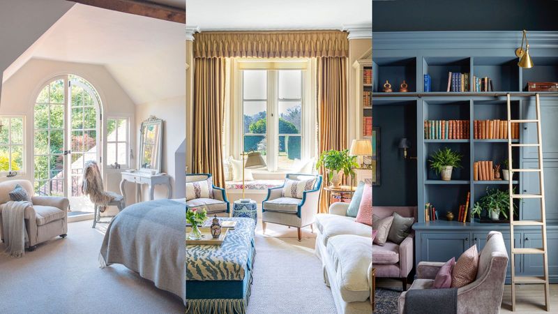
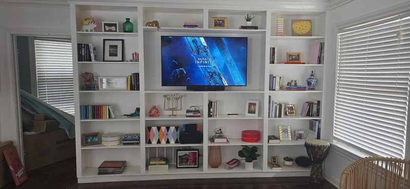
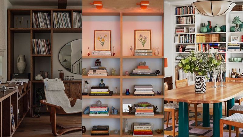
A well-styled bookshelf can elevate any room, adding character and charm. However, certain styling mistakes can make it look cluttered or unbalanced. From overcrowding with décor to ignoring symmetry, these missteps can take away from the overall aesthetic.
This guide highlights 20 common bookshelf styling mistakes and offers practical tips to help you create a visually appealing and functional display.
1. Overloading with Books
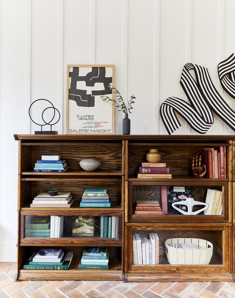
Bookshelves are meant for books, but cramming too many can create a messy look. If you find yourself feeling overwhelmed by the sheer number of books, consider a more curated approach. Allowing some space between books can actually make them more appealing.
One strategy is to alternate between vertical stacks and horizontal piles. This not only adds visual interest but also allows for some breathing space.
Decluttering by donating or storing books elsewhere can also help. Hence, a balance ensures your bookshelf remains a focal point without being chaotic.
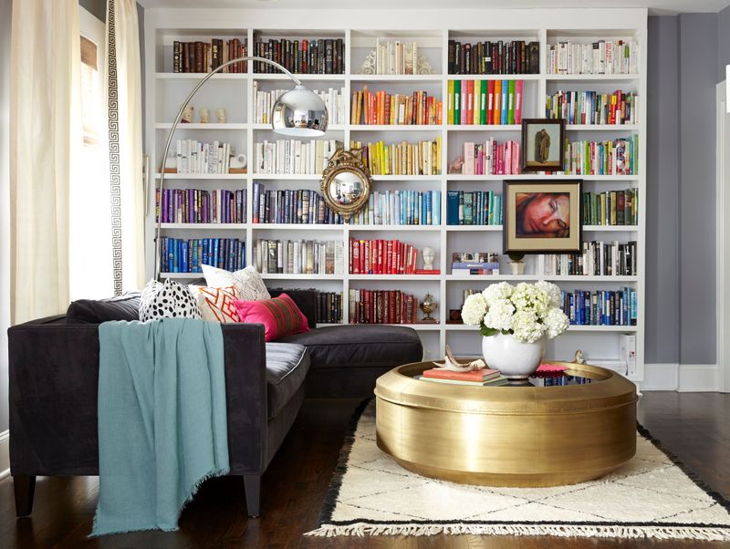
2. Ignoring Color Coordination
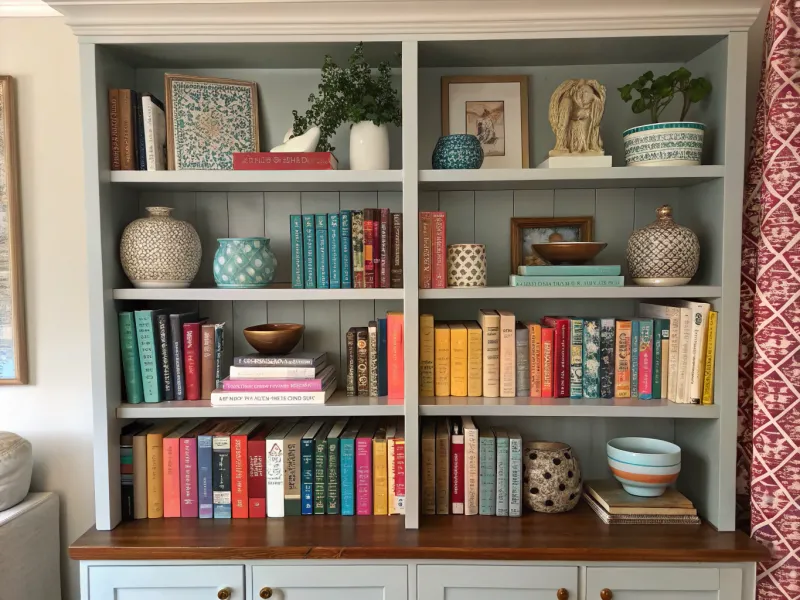
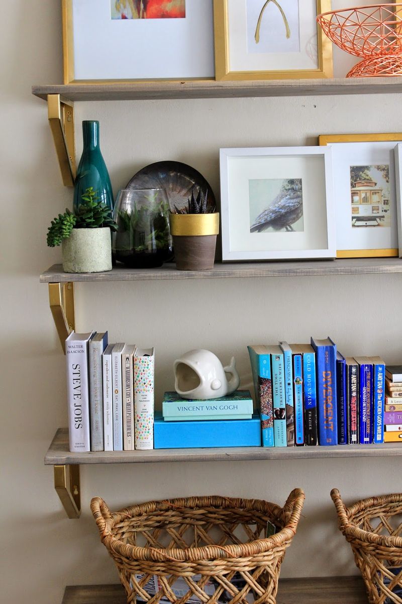
Color plays a pivotal role in styling, and ignoring it can disrupt the visual flow. If your bookshelf lacks a cohesive color scheme, it might look jarring. Consider using a limited palette to create harmony and interest.
Arranging books by color can be a fun and aesthetically pleasing approach. If you incorporate décor items, ensure they complement the overall scheme.
How you play with colors can transform your bookshelf into an art piece. Thus, thoughtful color coordination elevates the entire space.
3. Neglecting Vertical Space
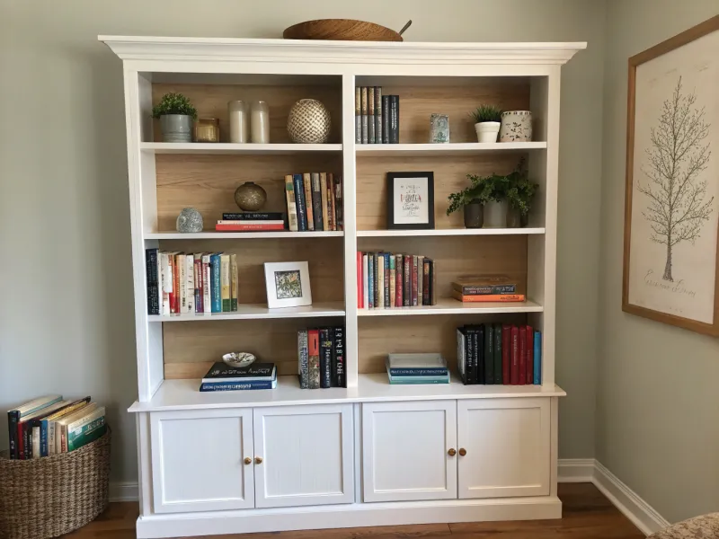
Vertical space is often overlooked, yet it offers a chance to enhance your bookshelf’s appearance. If you notice empty spaces above books, you might be missing out on potential styling opportunities.
Tall items, such as vases or sculptures, can fill these gaps beautifully. Alternatively, stacking smaller objects can also work wonders.
However, avoid overdoing it, as too many tall pieces can lead to a cluttered feel. By utilizing vertical space, you add depth and interest to your shelf display.
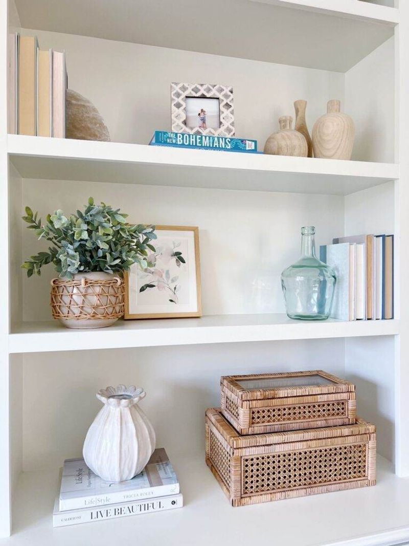
4. Lack of Diverse Textures
Texture adds dimension to any display, and a lack of variety can make a bookshelf feel flat. If everything on your shelf is made of the same material, consider introducing different textures.
This can include mixing smooth ceramics with rough textiles or glossy surfaces with matte finishes. Adding plants or woven baskets can also introduce interesting textures.
Though subtle, these changes can significantly impact the overall look. By diversifying textures, your bookshelf becomes more dynamic and engaging.
5. Failing to Layer Items
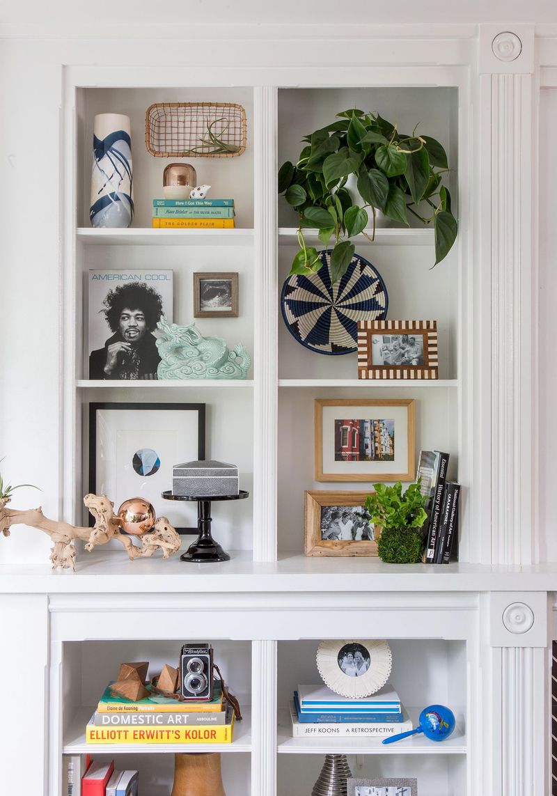
Layering is key to a visually appealing bookshelf, yet many fail to consider it. If items are arranged in a single line, the display can seem flat and uninspired. Layering allows you to create depth by placing smaller items in front of larger ones.
Picture frames, small sculptures, or even staggered books can work well to achieve this effect. How you layer can transform the shelf from mundane to captivating.
Therefore, incorporating layers adds richness and complexity.
6. Inconsistent Themes
Consistency is crucial in styling, and an inconsistent theme can confuse the eye. If you mix too many styles, the bookshelf may lack cohesion. It’s wise to choose a theme that resonates with your room’s overall design.
Sticking to a particular style, like modern, rustic, or vintage, helps create a unified look. Incorporating elements that reflect your personal taste adds authenticity.
Hence, a consistent theme ensures coherence and harmony.
7. Ignoring Functionality
While aesthetics are important, functionality should not be ignored. If decorative elements block access to books you often read, it becomes impractical. Consider how you use your bookshelf daily and plan accordingly.
Organize frequently used items within easy reach, while decorative pieces can occupy less accessible spots. Do ensure that functionality complements style, rather than hinders it.
Thus, balancing beauty with practicality enhances both usability and appearance.
8. Overuse of Small Decor
Small decorative items can add charm, but overusing them leads to clutter. If you find your bookshelf filled with tiny trinkets, it might be time to reassess. Opting for fewer but larger pieces can make a stronger statement.
Consider grouping small items together instead of spreading them out. This creates focal points without overwhelming the senses.
Therefore, a measured approach to decor selection enhances visual appeal.
9. Hiding Personal Touches
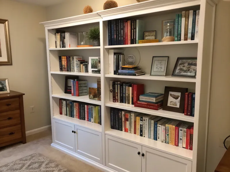
Personal touches bring warmth and character to any space. If your bookshelf lacks personal elements, it might feel impersonal and cold. Including family photos, travel souvenirs, or cherished mementoes can infuse personality.
You create a narrative that’s uniquely yours by adding these touches. However, be selective to avoid a cluttered appearance.
Balance is key to ensuring personal items enhance rather than distract from the overall look.
10. Uneven Shelf Spacing
Uneven shelf spacing can disrupt the visual balance of a bookshelf. If you notice awkward gaps or shelves that seem out of proportion, consider adjusting them.
Evenly spaced shelves allow for a more harmonious arrangement. Adjusting shelf heights to accommodate specific items can also work wonders.
How you space your shelves affects the overall symmetry and flow. Hence, thoughtful spacing creates a more cohesive and attractive display.
11. Ignoring the Backdrop
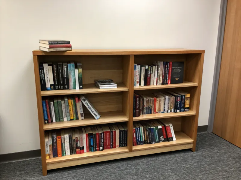
The backdrop of your bookshelf can significantly influence its overall look. If you’ve overlooked this area, it may appear dull. Consider painting the back panel a contrasting color or adding wallpaper for texture.
Mirrors or artwork can also serve as interesting backdrop elements. Through these additions, you create depth and intrigue.
Thus, enhancing the backdrop contributes to a more captivating shelf display.
12. Overuse of Symmetry
Symmetry can be pleasing, but overuse might make your bookshelf appear static. If every item is perfectly balanced, it may lack dynamic interest. Instead, consider a more asymmetrical arrangement for a lively feel.
Mixing different heights and sizes adds movement to the display. Though symmetry has its place, breaking it up can make your bookshelf more engaging.
Therefore, a balance between symmetry and asymmetry enhances visual stimulation.
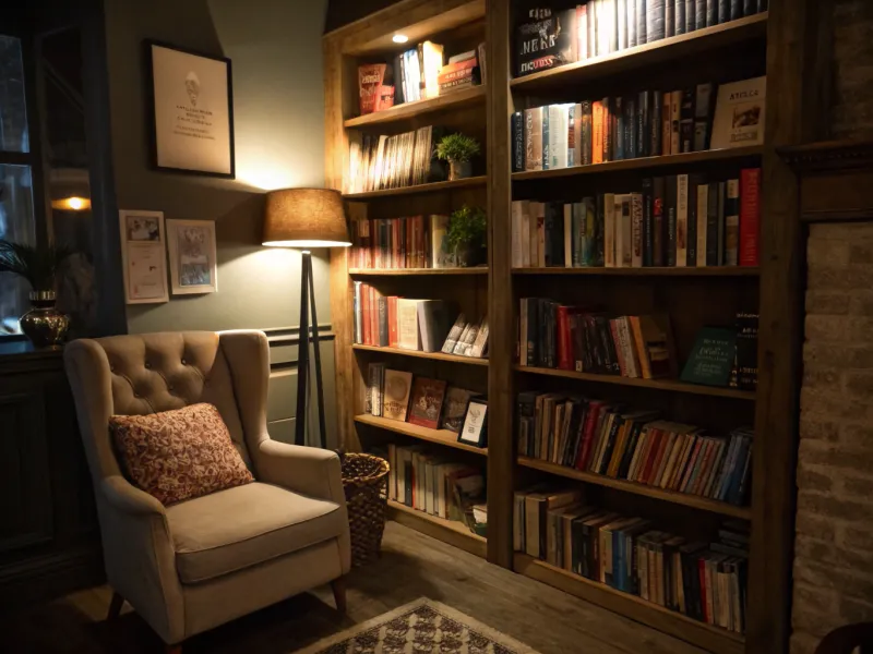
13. Neglecting Lighting
Adequate lighting is crucial for showcasing your bookshelf, yet it’s often neglected. If your shelf is dimly lit, valuable details might go unnoticed.
Consider adding focused lights, such as LED strips or spotlights, to illuminate key areas. Natural light can also be a factor, so positioning a bookshelf near windows can help.
How your shelf is lit affects its overall appeal. Thus, enhancing lighting can elevate the entire display.
14. Using Only Books
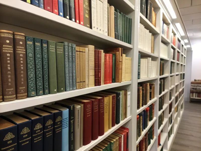
While books are the main attraction, using only them can lead to a monotonous look. If your shelf contains nothing but books, consider introducing decorative accents. Vases, art pieces, or sculptural objects can add variety.
Alternating between books and decor maintains interest and breaks the monotony. However, ensure that added items reflect your personal style.
By introducing variety, your bookshelf becomes a more vibrant part of your space.
15. Ignoring Proportions
Proportion is key to aesthetic balance, and ignoring it can lead to a jarring display. If large items dominate small shelves, or vice versa, it disrupts harmony. Consider how the size of items fits within the shelf dimensions.
Balancing large and small pieces creates visual equilibrium. How you proportion items affects the overall grace of your setup.
Therefore, thoughtful consideration of proportions enhances the visual flow.
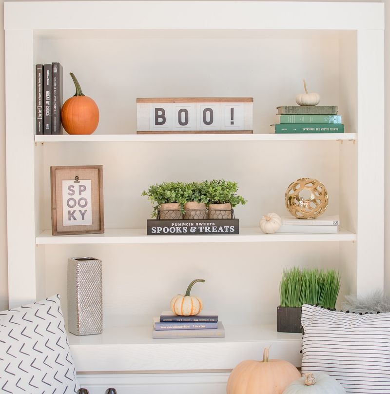
16. Neglecting Seasonal Changes
Changing decor with the seasons can refresh your space, yet many overlook this opportunity. If your bookshelf looks the same year-round, consider seasonal updates. Swapping out colors or themes keeps your display fresh.
Adding seasonal elements like flowers or themed decor can also bring new life. However, be mindful of over-cluttering when adding seasonal items.
Thus, embracing seasonal changes maintains a dynamic and engaging bookshelf.
17. Failing to Prioritize
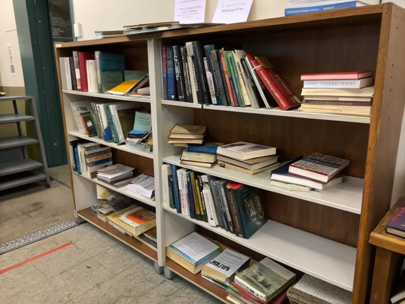
Prioritizing key pieces can make your bookshelf more cohesive. If your display lacks a focal point, it may seem cluttered and confusing. Consider which items you want to highlight and arrange others to support them.
Larger or standout pieces naturally draw the eye as focal points. However, too many can overwhelm the shelf.
Strategic selection ensures a cohesive and visually appealing display.
18. Ignoring Balance of Shapes
Shape balance is essential in creating an engaging display. If your bookshelf features similar-shaped items, it might appear monotonous. Incorporating a variety of shapes adds interest and complexity.
Mixing round objects with angular ones creates contrast and movement. However, ensure that the shapes complement each other rather than clash.
Therefore, balancing shapes enhances the overall aesthetic of your bookshelf.
19. Indiscriminate Use of Patterns
Patterns can add visual intrigue, but indiscriminate use leads to chaos. If your bookshelf features clashing patterns, it might feel visually unsettling.
Consider using patterns sparingly and with intention. Highlighting one or two patterns creates harmony.
While patterns add complexity, using them with restraint ensures they enhance rather than dominate. Thoughtful selection maintains a balanced and visually appealing bookshelf.
20. Overlooking the Top Surface
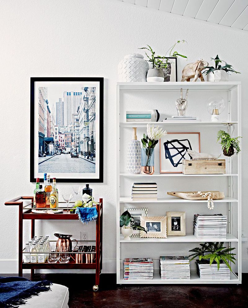
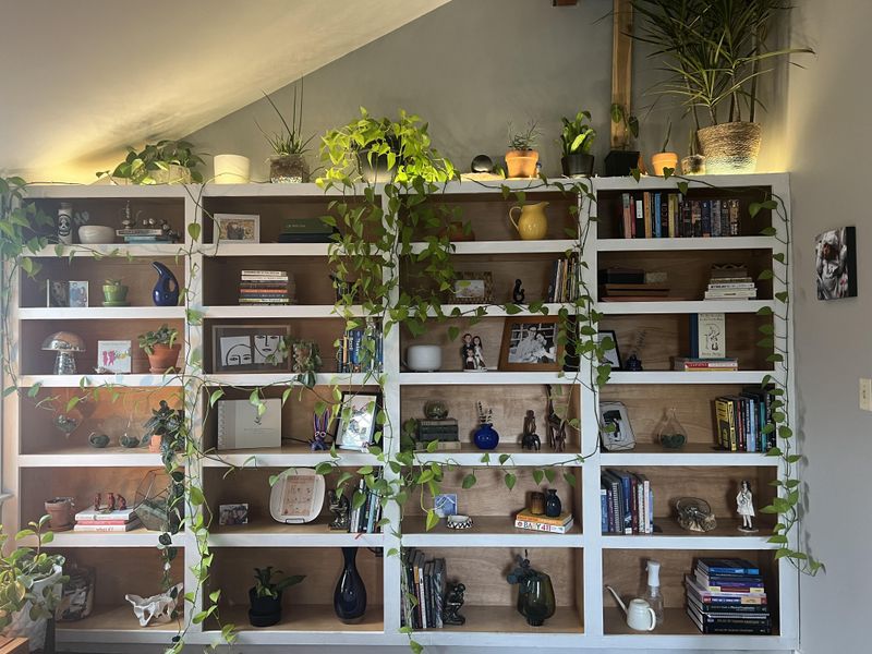
The top surface of a bookshelf is often overlooked, yet it offers styling opportunities. If this area is bare, consider using it for decorative elements or additional storage. Plants, art, or even a stylish tray can add interest.
Consider scale carefully to prevent items from overpowering the space. With intentional decoration, the top surface can seamlessly integrate into your overall design.
Enhancing this area adds a polished finishing touch to your bookshelf.
